What does the component do?
A toggle enables users to switch between two states, e.g. "Off" and "On".
When should the component be used?
- To provide a quick and easy way to activate or deactivate a function.
- When users need to change a setting that has an immediate effect.
- To present binary options clearly and intuitively.
Rules
- Avoid placing too many toggles on a page to ensure clarity and maintain usability.

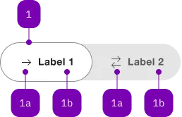
| Number | Type | Description | Optional | Info |
|---|---|---|---|---|
| 1 | Component | sbb-toggle-option | No | |
| 1a | Component | sbb-icon | Yes | |
| 1b | Text | Label | Yes |
Playground
Examples
The sbb-toggle component is a wrapper for a couple of sbb-toggle-options
that can be selected by the user; it is useful for switching between views within the content.
Their behavior is similar to sbb-tab-group
or sbb-radio-button-group,
where selecting an option deselects the previously selected one.
<sbb-toggle value="Value 1">
  <sbb-toggle-option value="Value 1">Bern</sbb-toggle-option>
  <sbb-toggle-option value="Value 2">Zürich</sbb-toggle-option>
</sbb-toggle>
States
The component can be displayed in disabled state using the self-named property.
<sbb-toggle disabled> ... </sbb-toggle>
Style
The even property can be used to let the component expand to the parent component or adapt to the label's width.
The component has two different sizes, s and m (default), which can be set using the size property.
<sbb-toggle size="s" even> ... </sbb-toggle>
Properties
| Name | Attribute | Privacy | Type | Default | Description |
|---|---|---|---|---|---|
disabled | disabled | public | boolean | false | Whether the toggle is disabled. |
even | even | public | boolean | false | If true, set the width of the component fixed; if false, the width is dynamic based on the label of the sbb-toggle-option. |
options | - | public | SbbToggleOptionElement[] | The child instances of sbb-toggle-option as an array. | |
size | size | public | 's' | 'm' | undefined | 'm' | Size variant, either m or s. |
value | value | public | string | null | The value of the toggle. It needs to be mutable since it is updated whenever a new option is selected (see the onToggleOptionSelect() method). |
Events
| Name | Type | Description | Inherited From |
|---|---|---|---|
change | CustomEvent<void> | Emits whenever the toggle value changes. | |
didChange | CustomEvent<void> | Deprecated. used for React. Will probably be removed once React 19 is available. |
Slots
| Name | Description |
|---|---|
Use the unnamed slot to add <sbb-toggle-option> elements to the toggle. |