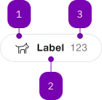
What does the component do?
It is part of the tag-group component.
When should the component be used?
- Only within the tag-group component.
Parent Components

| Number | Type | Description | Optional | Info |
|---|---|---|---|---|
| 1 | Component | sbb-icon | Yes | |
| 2 | Text | No | ||
| 3 | Text | Yes | Für Zusatzinfo: Nur Zahlen erlaubt. |
Playground
Examples
The sbb-tag is a component that can be used as a filter in order to categorize a large amount of information.
It's intended to be used inside the sbb-tag-group component.
<sbb-tag value="All">All</sbb-tag>
Slots
It is possible to provide a label via an unnamed slot; the component can optionally display a sbb-icon
at the component start using the iconName property or via custom content using the icon slot.
It's also possible to display a numeric amount at the component's end using the amount property or slot.
<sbb-tag value="All" icon-name="pie-small" amount="123"> All </sbb-tag>

<sbb-tag value="None">
  <sbb-icon slot="icon" name="pie-small"></sbb-icon>
  None
  <span slot="amount">123</span>
</sbb-tag>
States
The component can be displayed in checked or disabled state using the self-named property.
<sbb-tag checked value="All" amount="123">All</sbb-tag>

<sbb-tag disabled value="All" icon-name="circle-information-small">All</sbb-tag>
Style
The component has two sizes, named m (default) and s. The size property can also be set on the sbb-tag-group where it will be applied to all tags inside the group.
<sbb-tag value="All" size="m">All</sbb-tag>

<sbb-tag value="All" size="s">All</sbb-tag>
Events
Consumers can listen to the native change and input events on the sbb-tag.
The current state can be read from event.target.checked, while the value from event.target.value.
It's recommended to check the parent's sbb-tag-group for the value.
Accessibility
The component imitates an button element to provide an accessible experience.
The state is reflected via aria-pressed attribute.
Properties
| Name | Attribute | Privacy | Type | Default | Description |
|---|---|---|---|---|---|
amount | amount | public | string | undefined | Amount displayed inside the tag. | |
checked | checked | public | boolean | false | Whether the tag is checked. |
disabled | disabled | public | boolean | false | Whether the component is disabled. |
form | form | public | string | undefined | The | |
iconName | icon-name | public | string | undefined | The icon name we want to use, choose from the small icon variants from the ui-icons category from here https://icons.app.sbb.ch. | |
name | name | public | string | The name of the button element. | |
size | size | public | SbbTagSize | 'm' | Tag size. |
type | type | public | SbbButtonType | 'button' | The type attribute to use for the button. |
value | value | public | string | The value of the button element. |
Events
| Name | Type | Description | Inherited From |
|---|---|---|---|
change | CustomEvent<void> | Change event emitter | |
didChange | CustomEvent<void> | Deprecated. used for React. Will probably be removed once React 19 is available. | |
input | CustomEvent<void> | Input event emitter |
Slots
| Name | Description |
|---|---|
| Use the unnamed slot to add content to the tag label. | |
amount | Provide an amount to show it at the component end. |
icon | Use this slot to display an icon at the component start, by providing a sbb-icon component. |