What does the component do?
A status indicates the current state or status of an object, process or system by using colour, icon and text.
When should the component be used?
- To make the current state of a process, system or object clear.
- To inform users about the status of tasks or system states.
Rules
- Please ensure that the status displays are used consistently across the website or application.

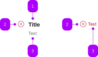
| Number | Type | Description | Optional | Info |
|---|---|---|---|---|
| 1 | Component | sbb-title | Yes | |
| 2 | Component | sbb-icon | – | Zeigt Status an. |
| 3 | Text | No |
Playground
with Title
without Title
The <sbb-status> is a component that has the purpose to show the user short messages to update the current status.
The status element displays a brief text message preceded by the status icon.
The <sbb-status> is structured in the following way:
- Icon: informs user about the current status type
- Title (optional): gives user an overview of the message
- Message: provide the information to the user
<sbb-status>Status info text</sbb-status>
Variants
The <sbb-status> supports eight types, based on the type of the information displayed:
info(default)successwarnerrorpendingincompletenot-startedin-progress
<sbb-status type="info">...</sbb-status>
<sbb-status type="success">...</sbb-status>
<sbb-status type="warn">...</sbb-status>
<sbb-status type="error">...</sbb-status>
<sbb-status type="pending">...</sbb-status>
<sbb-status type="incomplete">...</sbb-status>
<sbb-status type="not-started">...</sbb-status>
<sbb-status type="in-progress">...</sbb-status>
Title
An optional <sbb-title> can be slotted.
<sbb-status>
  <sbb-title level="3">Title</sbb-title>
  Status info text
</sbb-status>
Icon
The icon is primarily predefined and bound to the status.
However, it's possible to override this by using iconName property or icon slot.
Style
The <sbb-status> use default message colors, based on the chosen type.
Accessibility
The message text is wrapped into a <p> element to guarantee the semantic meaning.
Avoid slotting block elements (e.g. <div>) as this violates semantic rules and can have negative effects on screen-readers.
If needed, the role="status" attribute can be added on the component's tag.
<sbb-status role="status" type="error">An error occurred.</sbb-status>
API Documentation
class: SbbStatusElement, sbb-status
Properties
| Name | Attribute | Privacy | Type | Default | Description |
|---|---|---|---|---|---|
iconName | icon-name | public | string | '' | The icon name we want to use, choose from the small icon variants from the ui-icons category from here https://icons.app.sbb.ch. |
type | type | public | SbbStatusType | 'info' | The type of the status. |
CSS Properties
| Name | Default | Description |
|---|---|---|
--sbb-status-color | var(--sbb-color-iron) | Specify a custom color, which will override the predefined color for any type. |
--sbb-status-text-color | var(--sbb-status-color) | Specify a custom text color, which will override the predefined color for any type. Only valid for a status without a title. |
Slots
| Name | Description |
|---|---|
Use the unnamed slot to add an optional sbb-title and content to the status message. | |
icon | Use this slot to override the default status icon. |
title | Slot for the title. For the standard sbb-title element, the slot is automatically assigned when slotted in the unnamed slot. |