What does the component do?
A notification is a message that informs users about important information, successes, errors or other events in the application.
When should the component be used?
- To inform users about the status of actions, e.g. success or error messages.
- To display important system messages or updates.
- To inform users of required actions or changes.
Rules
- Notifications should be clear and concise in order to convey the message quickly.
- Provide the option to close notifications manually or have them disappear automatically after a reasonable time.
- Use consistent positioning of notifications within a website or application.

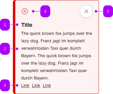
| Number | Type | Description | Optional | Info |
|---|---|---|---|---|
| 1 | Component | sbb-title | Yes | |
| 2 | Text | Beschreibung | No | |
| 3 | Component | sbb-link | Yes | |
| 4 | Component | sbb-icon | No | Zeigt den entsprechenden Status an. |
| 5 | Component | sbb-secondary-button | Yes |
Playground
The <sbb-notification> is a component which purpose is to inform users of updates.
A notification is an element that displays a brief, important message
in a way that attracts the user's attention without interrupting the user's task.
Inline notifications show up in task flows, to notify users of an action status or other information.
They usually appear at the top of the primary content area or close to the item needing attention.
The <sbb-notification> is structured in the following way:
- Icon: informs users of the notification type at a glance.
- Title (optional): gives users a quick overview of the notification.
- Close button (optional): closes the notification.
- Message: provides additional detail and/or actionable steps for the user to take.
<sbb-notification>
  <sbb-title level="3">Notification title</sbb-title>
  The quick brown fox jumps over the lazy dog. The quick brown fox jumps over the lazy dog.
  <sbb-link href="/">Link one</sbb-link>
  <sbb-link href="/">Link two</sbb-link>
  <sbb-link href="/">Link three</sbb-link>
</sbb-notification>
Note that the notification only supports inline links.
Variants
The <sbb-notification> supports the types info (default), note, success, warn and error, based on the type of the information displayed.
<sbb-notification type="success">...</sbb-notification>

<sbb-notification type="warn">...</sbb-notification>

<sbb-notification type="error">...</sbb-notification>
States
It is possible to display the component in readonly state by using the self-named property.
In this case, the close button will not be shown.
<sbb-notification readonly> ... </sbb-notification>
Interactions
Inline notifications do not dismiss automatically.
They persist on the page until the user dismisses them or takes action that resolves the notification.
By default, a close button is displayed to dismiss inline notifications. Including the close button is optional
and should not be included if it is critical for a user to read or interact with the notification by setting the readonly property to true.
Style
If the <sbb-notification> host needs a margin, in order to properly animate it on open/close,
we suggest using the --sbb-notification-margin variable to set it.
For example, use --sbb-notification-margin: 0 0 var(--sbb-spacing-fixed-4x) 0 to apply a bottom margin.
Accessibility
In order to announce the notification's content to screen readers as it becomes visible,
consumers must use the aria-live attribute with the polite value on the component's container.
This ensures that users who rely on screen readers are promptly informed of any relevant updates or changes.
<!-- Add here any incoming notification by adding a sbb-notification component. -->
<div id="notification-container" aria-live="polite">
  <sbb-notification type="success">Task successfully completed.</sbb-notification>
</div>
Animation
Set the animation property to manage which animations are enabled.
As a base rule, opening animations should be active if a notification arrives after the initial page load.
API Documentation
class: SbbNotificationElement, sbb-notification
Properties
| Name | Attribute | Privacy | Type | Default | Description |
|---|---|---|---|---|---|
animation | animation | public | 'open' | 'close' | 'all' | 'none' | 'all' | The enabled animations. |
iconName | icon-name | public | string | '' | The icon name we want to use, choose from the small icon variants from the ui-icons category from here https://icons.app.sbb.ch. |
readOnly | readonly | public | boolean | false | Whether the component is readonly. |
size | size | public | 's' | 'm' | 'm' / 's' (lean) | Size variant, either s or m. |
type | type | public | 'info' | 'note' | 'success' | 'warn' | 'error' | 'info' | The type of the notification. |
Methods
| Name | Privacy | Description | Parameters | Return | Inherited From |
|---|---|---|---|---|---|
close | public | void |
Events
| Name | Type | Description | Inherited From |
|---|---|---|---|
beforeclose | Event | Emits when the closing animation starts. Can be canceled to prevent the component from closing. | |
beforeopen | Event | Emits when the opening animation starts. | |
close | Event | Emits when the closing animation ends. | |
open | Event | Emits when the opening animation ends. |
CSS Properties
| Name | Default | Description |
|---|---|---|
--sbb-notification-margin | 0 | Can be used to modify the margin in order to get a smoother animation. See style section for more information. |
Slots
| Name | Description |
|---|---|
Use the unnamed slot to add content to the sbb-notification. Content should consist of an optional sbb-title element and text content. | |
icon | Use this slot to display a custom icon by providing an sbb-icon component. |
title | Slot for the title. For the standard sbb-title element, the slot is automatically assigned when slotted in the unnamed slot. |