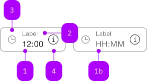
What does the component do?
A time input enables users to enter a time in a specified format.
When should the component be used?
- To enable users to enter times, e.g. when making appointments or schedules.
- When accurate time entry is required, e.g. for alarms or reminders.
- To ensure that times are entered in the correct format.
Rules
- Validation of the entry is intended to ensure that only valid times are accepted.

| Number | Type | Description | Optional | Info |
|---|---|---|---|---|
| 1 | Standard-HTML | input | No | |
| 1b | Standard-HTML | input | Yes | Placeholder |
| 2 | Standard-HTML | label | Yes | |
| 3 | Component | sbb-icon | Yes | Prefix |
| 4 | Component | sbb-icon oder sbb-form-field-clear | Yes | Suffix |
| 5 | Component | sbb-form-error | No | Datei auswählen |
Playground
The <sbb-time-input> is an input component that displays the typed value as a formatted time (HH:mm).
<sbb-time-input value="15:00"></sbb-time-input>
The component allows the insertion of up to 4 numbers, possibly with a separator char like ., :, , or -,
then automatically formats the value as time and displays it (see "Format example").
In <sbb-form-field>
The <sbb-time-input> can be used within an <sbb-form-field>:
<sbb-form-field width="collapse" size="s">
  <sbb-time-input value="13:30"></sbb-time-input>
</sbb-form-field>
The initial value can be set using the value property (string) or attribute.
To get or set the value as a Date object, the valueAsDate property can be used.
The returned date has its date always set to 01.01.1970 and only the hours and minutes
are set to the current value of the element.
e.g.: with a value of 12:34, the valueAsDate will be 01.01.1970, 12:34:00 UTC.
If the value is invalid because not real (e.g. 12:61 or 25:30), the component does
not format the value, and valueAsDate will return null.
Format example
See the table below for some formatting examples:
| Input | Output |
|---|---|
| 12:34 | 12:34 |
| 1 | 01:00 |
| 12 | 12:00 |
| 123 | 01:23 |
| 1234 | 12:34 |
| 1. | 01:00 |
| 1.2 | 01:02 |
| 1.23 | 01:23 |
| 12: | 12:00 |
| 12.3 | 12:03 |
| 12,34 | 12:34 |
| 12-34 | 12:34 |
Events
Similar to the native <input> element, the <sbb-time-input> component
dispatches the usual input, change, blur, invalid and keyboard
and focus related events.
API Documentation
class: SbbTimeInputElement, sbb-time-input
Properties
| Name | Attribute | Privacy | Type | Default | Description |
|---|---|---|---|---|---|
disabled | disabled | public | boolean | false | Whether the component is disabled. |
form | - | public | HTMLFormElement | null | Returns the form owner of this element. | |
name | name | public | string | Name of the form element. Will be read from name attribute. | |
placeholder | - | public | string | ||
readOnly | readonly | public | boolean | false | Whether the component is readonly. |
required | required | public | boolean | false | Whether the component is required. |
type | - | public | string | 'text' | Form type of element. |
validationMessage | - | public | string | Returns the current error message, if available, which corresponds to the current validation state. Please note that only one message is returned at a time (e.g. if multiple validity states are invalid, only the chronologically first one is returned until it is fixed, at which point the next message might be returned, if it is still applicable). Also, a custom validity message (see below) has precedence over native validation messages. | |
validity | - | public | ValidityState | Returns the ValidityState object for this element. | |
value | value | public | string | '' | The value of the input. Reflects the current text value of this input. |
valueAsDate | - | public | Date | null | Formats the current input's value as date. | |
willValidate | - | public | boolean | Returns true if this element will be validated when the form is submitted; false otherwise. |
Methods
| Name | Privacy | Description | Parameters | Return | Inherited From |
|---|---|---|---|---|---|
checkValidity | public | Returns true if this element has no validity problems; false otherwise. Fires an invalid event at the element in the latter case. | boolean | SbbFormAssociatedMixin | |
focus | public | options: FocusOptions | void | SbbFormAssociatedInputMixin | |
reportValidity | public | Returns true if this element has no validity problems; otherwise, returns false, fires an invalid event at the element, and (if the event isn't canceled) reports the problem to the user. | boolean | SbbFormAssociatedMixin | |
select | public | Makes the selection equal to the current object. | void | SbbFormAssociatedInputMixin | |
setCustomValidity | public | Sets the custom validity message for this element. Use the empty string to indicate that the element does not have a custom validity error. | message: string | void | SbbFormAssociatedMixin |
Events
| Name | Type | Description | Inherited From |
|---|---|---|---|
change | Event | The change event is fired when the user modifies the element's value. Unlike the input event, the change event is not necessarily fired for each alteration to an element's value. | SbbFormAssociatedInputMixin |
input | InputEvent | The input event fires when the value has been changed as a direct result of a user action. | SbbFormAssociatedInputMixin |