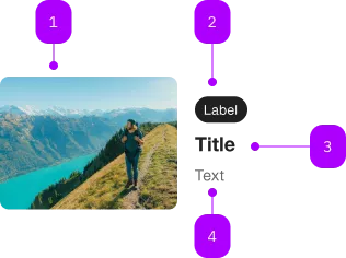
What does the component do?
A teaser is a preview that is intended to arouse users' curiosity and encourage them to click on further content or pages.
When should the component be used?
- To highlight and promote content, articles, products or services.
- To make users aware of further information or interesting content.
Rules
- Use a catchy and inviting headline and a short, interesting description.
- Do not use too many different teaser types and sizes on one page.
- Several teasers can be structured with one title.
Sibling Components

| Number | Type | Description | Optional | Info |
|---|---|---|---|---|
| 1 | Component | sbb-image | No | |
| 2 | Component | sbb-chip | Yes | |
| 3 | Component | sbb-title | No | |
| 4 | Text | Subtext | No |
Playground
 This is a paragraph
Examples
The sbb-teaser is a component which can display an image with a caption, and it behaves like a link on user interaction.
Simple teaser example:
<sbb-teaser
  href="https://www.sbb.ch"
  title-level="2"
  title-content="Title"
  chip-content="Chip label"
>
  <img slot="image" src="..." alt="400x300" />
  A brief description.
</sbb-teaser>
Slots
The default slot is reserved for the description. The component displays the image and the title with the self-named slots.
It's also possible to display a sbb-chip using the chip slot.
<sbb-teaser href="https://www.sbb.ch" title-level="2">
  <img slot="image" src="..." alt="400x300" />
  <span slot="chip">Chip label</span>
  <span slot="title">Title</span>
  A brief description.
</sbb-teaser>
Style
Using the alignment property, it is possible to change the text position respect to the image.
Possible values are after-centered (default), after and below.
<sbb-teaser href="https://www.sbb.ch" aligment="below"> ... </sbb-teaser>
By default, the image dimensions are set using the width and the aspect ratio.
Default values are 300px and 4/3. Consumers can change these values on their slotted image element.
Accessibility
It's important to set the aria-label on the <sbb-teaser>, which describes the sbb-teaser for screen-reader users.
The description text is wrapped into an <p> element to guarantee the semantic meaning.
Avoid slotting block elements (e.g. <div>) as this violates semantic rules and can have negative effects on screen readers.
Properties
| Name | Attribute | Privacy | Type | Default | Description |
|---|---|---|---|---|---|
accessibilityLabel | accessibility-label | public | string | undefined | This will be forwarded as aria-label to the inner anchor element. | |
alignment | alignment | public | 'after-centered' | 'after' | 'below' | 'after-centered' | Teaser variant - define the position and the alignment of the text block. |
chipContent | chip-content | public | string | undefined | Content of chip. | |
download | download | public | boolean | undefined | Whether the browser will show the download dialog on click. | |
href | href | public | string | undefined | The href value you want to link to. | |
rel | rel | public | string | undefined | The relationship of the linked URL as space-separated link types. | |
target | target | public | LinkTargetType | string | undefined | Where to display the linked URL. | |
titleContent | title-content | public | string | undefined | Content of title. | |
titleLevel | title-level | public | SbbTitleLevel | '5' | Heading level of the sbb-title element (e.g. h1-h6). |
Slots
| Name | Description |
|---|---|
| Use the unnamed slot to render the description. | |
chip | Slot used to render the sbb-chip label. |
image | Slot used to render the image. |
title | Slot used to render the title. |