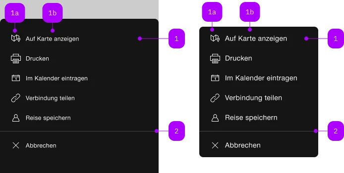
What does the component do?
A menu shows context-dependent actions or options for a defined element. It can be called up by another interactive element like e.g. a button.
When should the component be used?
- To provide users with quick access to frequently used actions or options that are relevant for a specific element.
- When compact and contextualised navigation is required.
- To increase usability by providing additional options directly at the point of action.
Rules
- Menu options should be clearly labelled and easy to understand.
- Make sure that the menu options are logically grouped and arranged in a useful order.
- Avoid too many options in a context menu to ensure clarity and not overwhelm users.
Child Components

| Number | Type | Description | Optional | Info |
|---|---|---|---|---|
| 1 | Component | sbb-menu-button oder sbb-menu-link | No | |
| 1a | Component | sbb-icon | No | |
| 1b | Text | Label | Yes | |
| 2 | Component | sbb-divider | Yes |
Playground
Examples
The sbb-menu is a component that can be attached to any element to open and display a custom context menu,
which allows to perform actions relevant to the current task by using the sbb-menu-button
or to navigate within or outside the application by using the sbb-menu-link component along with it.
Interactions
The element that will trigger the menu dialog must be set using the trigger property.
The sbb-menu appears on trigger left click, and it is displayed as a sheet with a backdrop on mobile,
while on desktop it will be shown as a floating menu, and it will calculate the optimal position relative to the trigger element
by evaluating the available space with the following priority: start/below, start/above, end/below, end/above.
Clicking in the backdrop or pressing the ESC key closes the menu.
<!-- Trigger element -->
<sbb-button id="menu-trigger">Menu trigger</sbb-button>

<!-- Menu component with menu actions -->
<sbb-menu trigger="menu-trigger">
  <sbb-menu-link icon="link-small" href="https://www.sbb.ch/en">View</sbb-menu-link>
  <sbb-menu-button icon="pen-small">Edit</sbb-menu-button>
  <sbb-menu-button icon="swisspass-small" amount="123">Details</sbb-menu-button>
  <sbb-divider></sbb-divider>
  <sbb-menu-button icon="cross-small">Cancel</sbb-menu-button>
</sbb-menu>
You can also provide custom content inside the sbb-menu:
<!-- Trigger element -->
<sbb-button id="menu-trigger">Menu trigger</sbb-button>

<!-- Menu component with custom content and menu actions -->
<sbb-menu trigger="menu-trigger">
  <div>Christina Müller</div>
  <span>UIS9057</span>
  <sbb-block-link href="https://www.sbb.ch/en" negative size="xs">Profile</sbb-block-link>
  <sbb-divider></sbb-divider>
  <sbb-menu-link icon="link-small" href="https://www.sbb.ch/en">View</sbb-menu-link>
  <sbb-menu-button icon="pen-small">Edit</sbb-menu-button>
  <sbb-menu-button icon="swisspass-small" amount="123">Details</sbb-menu-button>
  <sbb-divider></sbb-divider>
  <sbb-menu-button icon="cross-small">Cancel</sbb-menu-button>
</sbb-menu>
Style
If only sbb-menu-button/sbb-menu-link components are provided, the items are automatically grouped within a list
using <ul> and <li> items, for more complex scenarios the grouping must be done manually.
Accessibility
As the menu opens, the focus will automatically be set to the first focusable item within the component.
When using the sbb-menu as a select (e.g. language selection) it's recommended to use the aria-pressed attribute
to identify which actions are active and which are not.
Properties
| Name | Attribute | Privacy | Type | Default | Description |
|---|---|---|---|---|---|
listAccessibilityLabel | list-accessibility-label | public | string | undefined | This will be forwarded as aria-label to the inner list. Used only if the menu automatically renders the actions inside as a list. | |
trigger | trigger | public | string | HTMLElement | null | null | The element that will trigger the menu overlay. Accepts both a string (id of an element) or an HTML element. |
Methods
| Name | Privacy | Description | Parameters | Return | Inherited From |
|---|---|---|---|---|---|
close | public | Closes the menu. | void | SbbOpenCloseBaseElement | |
open | public | Opens the menu on trigger click. | void | SbbOpenCloseBaseElement |
Events
| Name | Type | Description | Inherited From |
|---|---|---|---|
didClose | CustomEvent<void> | Emits whenever the sbb-menu is closed. | SbbOpenCloseBaseElement |
didOpen | CustomEvent<void> | Emits whenever the sbb-menu is opened. | SbbOpenCloseBaseElement |
willClose | CustomEvent<void> | Emits whenever the sbb-menu begins the closing transition. Can be canceled. | SbbOpenCloseBaseElement |
willOpen | CustomEvent<void> | Emits whenever the sbb-menu starts the opening transition. Can be canceled. | SbbOpenCloseBaseElement |
CSS Properties
| Name | Default | Description |
|---|---|---|
--sbb-menu-z-index | var(--sbb-overlay-default-z-index) | To specify a custom stack order, the z-index can be overridden by defining this CSS variable. The default z-index of the component is set to var(--sbb-overlay-default-z-index) with a value of 1000. |
Slots
| Name | Description |
|---|---|
Use the unnamed slot to add sbb-menu-button/sbb-menu-link or other elements to the menu. |