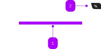
What does the component do?
A card is a flexible container element that combines different types of content and actions in a single block.
When should the component be used?
- To present related information in a compact way.
- To bring visual hierarchies and structure to a page.
- To display content such as text and actions together.
Rules
- The content within a card should be logically related and well structured. The content should be formulated as precisely as possible.
- If a card has several interactive elements, the click targets should be placed on the interactive elements used. If the card has only one interactive element, the entire card can be used as a click target.
Child Components

| Number | Type | Description | Optional | Info |
|---|---|---|---|---|
| 1 | Slot | Beliebiger Inhalt erlaubt | No | |
| 2 | Component | sbb-card-badge | Yes |
Playground
Default
With Card-Link
Examples
The sbb-card component is a generic content container; its task is to contain content related to a single subject.
<sbb-card>Card content</sbb-card>
Slots
The content is projected in an unnamed slot.
It's possible to use the component together with the sbb-card-badge and the sbb-card-button/sbb-card-link.
With sbb-card-badge
The sbb-card-badge component can be used to display a badge in the upper right corner.
The badge is hidden with card sizes are xs or s.
For API details, see the sbb-card-badge docs.
<sbb-card size="m" color="white">
  <sbb-card-badge>
    <span>%</span>
    <span>from CHF</span>
    <span>19.99</span>
  </sbb-card-badge>
  Card content
</sbb-card>
With sbb-card-button/sbb-card-link
To add an action to a card, add a sbb-card-button or a sbb-card-link to the main slot.
With these components, all the card area becomes clickable.
For API details (mainly accessibility), see the sbb-card-button or
the sbb-card-link docs.
<sbb-card>
  <sbb-card-link href="https://www.sbb.ch">Check all the wonderful trips available.</sbb-card-link>
  Buy trips
</sbb-card>

<sbb-card>
  <sbb-card-button type="submit" form="buy" value="trip">Buy this trip.</sbb-card-button>
</sbb-card>
Style
It's possible to choose among seven different values for the size property (from xs to xxxl, default m);
the choice mainly affects the content's padding.
<sbb-card size="xs">Card content</sbb-card>
<sbb-card size="s">Card content</sbb-card>
<sbb-card size="m">Card content</sbb-card>
<sbb-card size="l">Card content</sbb-card>
<sbb-card size="xl">Card content</sbb-card>
<sbb-card size="xxl">Card content</sbb-card>
<sbb-card size="xxxl">Card content</sbb-card>
The component has four different values to choose from for the color property; default is white.
<sbb-card color="milk">Card content</sbb-card>
<sbb-card color="transparent-bordered">Card content</sbb-card>
<sbb-card color="transparent-bordered-dashed">Card content</sbb-card>
Accessibility
Normally, a sbb-card should be a single action, however, it's possible to place other interactive elements
in the card content. Interactive content will automatically be detected and made accessible to click / focus.
In cases where there should be only a visual button or link inside the card content without a different action, the
static component should be used (e.g. <sbb-button-static></sbb-button-static>).
Windows High Contrast Notes
In high contrast mode, all the content of a link or a button receives a specific color which overrides every other color.
However, as the content of the card is not directly inside the button or link,
this does not happen when the slotted content has a specific color set.
To improve coloring, it's needed to manually define styles for Window high contrast mode (setting LinkText or ButtonText).
Properties
| Name | Attribute | Privacy | Type | Default | Description |
|---|---|---|---|---|---|
color | color | public | | 'white' | 'milk' | 'transparent-bordered' | 'transparent-bordered-dashed' | 'white' | Option to set the component's background color. |
size | size | public | 'xs' | 's' | 'm' | 'l' | 'xl' | 'xxl' | 'xxxl' | 'm' | Size variant, either xs, s, m, l, xl, xxl or xxxl. |
Slots
| Name | Description |
|---|---|
| Use the unnamed slot to add content to the card. | |
action | Use this slot to render a sbb-card-button or a sbb-card-link component. |
badge | Use this slot to render a sbb-card-badge component. |