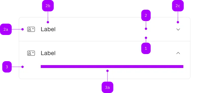
What does the component do?
Hides content behind a title. The corresponding content can be shown or hidden by clicking on the title.
When should the component be used?
- To improve the information architecture of a page or to structure content.
- To avoid long scrolling.
- To ensure/provide clarity.
Rules
- An accordion should consist of at least two entries.
- Nested accordions are not permitted.
Child Components

| Number | Type | Description | Optional | Info |
|---|---|---|---|---|
| 1 | Component | sbb-extension-panel | No | |
| 2 | Component | sbb-expansion-panel-header | No | |
| 2a | Component | sbb-icon | Yes | |
| 2b | Text | Label | No | |
| 2c | Component | sbb-icon | No | Zeigt den Zustand an |
| 3 | Component | sbb-expansion-panel-content | No | |
| 3a | Slot | Beliebiger Inhalt erlaubt | No |
Playground
Examples
The sbb-accordion is a component which acts as a container
for one or more sbb-expansion-panel.
<sbb-accordion>
  <sbb-expansion-panel>
    <sbb-expansion-panel-header>Header 1</sbb-expansion-panel-header>
    <sbb-expansion-panel-content>Content 1</sbb-expansion-panel-content>
  </sbb-expansion-panel>
  <sbb-expansion-panel>
    <sbb-expansion-panel-header>Header 2</sbb-expansion-panel-header>
    <sbb-expansion-panel-content>Content 2</sbb-expansion-panel-content>
  </sbb-expansion-panel>
</sbb-accordion>
Interaction
The multi property, if set, allows having more than one sbb-expansion-panel expanded at the same time.
<sbb-accordion multi> ... </sbb-accordion>
Style
The component has two different sizes, l (default) and s, which can be changed using the size property.
The property overrides the size value of any inner sbb-expansion-panel.
<sbb-accordion size="s"> ... </sbb-accordion>
The component has a titleLevel property, which is proxied to each inner sbb-expansion-panel-header, and can be used
to wrap the header of each sbb-expansion-panel in a heading tag; if the property is unset, a div is used.
In the following example, all the sbb-expansion-panel-header would be wrapped in a h3 heading tag.
<sbb-accordion title-level="3">
  <sbb-expansion-panel>
    <sbb-expansion-panel-header>Header 1</sbb-expansion-panel-header>
    <sbb-expansion-panel-content>Content 1</sbb-expansion-panel-content>
  </sbb-expansion-panel>
  ...
</sbb-accordion>
Properties
| Name | Attribute | Privacy | Type | Default | Description |
|---|---|---|---|---|---|
multi | multi | public | boolean | false | Whether more than one sbb-expansion-panel can be open at the same time. |
size | size | public | 's' | 'l' | 'l' | Size variant, either l or s; overrides the size on any projected sbb-expansion-panel. |
titleLevel | title-level | public | SbbTitleLevel | null | null | The heading level for the sbb-expansion-panel-headers within the component. |
Slots
| Name | Description |
|---|---|
Use the unnamed slot to add sbb-expansion-panel elements. |