Zur Navigation Zum Inhalt Kontakt Menu Find component Overview Lyne Principles Foundation Accessibility Design System Guidelines Deutsch Français Italiano English Our design principles User-centred Recognisable Inclusive Reduced Holistic Self-explanatory Task-oriented Appropriate SBB Brand portal Logo Digital clock Rights of use Base colors Functional colors Off brand colors Icons Timetable icons Pictograms About accessibility Über diesen Guide Contact Further information Product Owner User Research Interaction Design Visual Design Development Content Design Testing What is a design system? Designing Coding FAQ Help Process Contribution Contact Overview Base Components Overview Releases Design Tokens Components Roadmap Overview Base Informationen Overview Base Components Sense & Purpose Community Assets Instructions App Icons Power-Apps Digital banner ads SAP Design Guidelines Selection-Expansion-Panel Info

What does the component do?

It is wrapped around a Checkbox-Panel or a radio Radio-Button-Panel and offers the option of displaying additional content for the panels.

When should the component be used?

  • If additional content (e.g. for sub-options, information) is to be displayed for a Checkbox-Panel or a Radio-Button-Panel.

Rules

  • The additional content (per panel) can always be displayed or only in the selected state.
  • Selection expansion panels should only be used within Checkbox-Groups and Radio-Button-Groups.
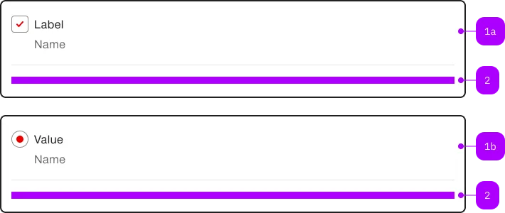
Checkbox-Panel Radio-Button-Panel
Anatomy
Anatomy of the component
Number Type Description Optional Info
1a Component sbb-checkbox-panel No
1b Component sbb-radio-button-panel No
2 Slot For additional content No
Demo

Playground

LabelSubtextCHF 40.00%
Inner ContentLink
Color White Milk Always show content No Yes Sizes S M Background White Milk Iron Charcoal Black
With Checkbox
With Radio Button
With Checkbox Size S
With Radio Button Size S
With Checkbox Checked
With Radio Button Checked
With Checkbox Disabled
With Radio Button Disabled
With Checkbox Checked Disabled
With Radio Button Checked Disabled
With Checkbox Group
With Radio Button Group
With Checkbox Group Size S
With Radio Button Group Size S
With Checkbox Group Force Open
With Radio Button Group Force Open
With Radio Button Group Allow Empty
With Checkbox Group Milk
With Radio Button Group Milk
With Checkbox Borderless
With Radio Button Borderless
With Checkbox Group Milk Borderless
With Radio Button Group Milk Borderless
With Checkboxes Error Message
With Radios Error Message
Tickets Options Example
Nested Radios
Nested Checkboxes
Nested Radios Size S
Nested Checkboxes Size S
Copy HTML to clipboard.
Implementation

The sbb-selection-expansion-panel component wraps either a sbb-checkbox-panel
or a sbb-radio-button-panel that can toggle a content section.

The content section can be opened by checking sbb-checkbox-panel or selecting the sbb-radio-button-panel.
Additionally, clicking on all the upper area sets the checked state and therefore opens the content;
clicking on the content area does not toggle anything.

The selection panel can also be used inside a sbb-radio-button-group
or a sbb-checkbox-group.

With sbb-radio-button-group

<sbb-radio-button-group>
  <sbb-selection-expansion-panel>
    <sbb-radio-button-panel>
      <sbb-card-badge>%</sbb-card-badge>
      Value
      <span slot="subtext">Subtext</span>
      <span slot="suffix">
        <sbb-icon></sbb-icon>
        <span class="sbb-text-xs sbb-text--bold">CHF</span>
        <span class="sbb-text-m sbb-text--bold">40.00</span>
      </span>
    </sbb-radio-button-panel>
    <div slot="content">Inner Content</div>
  </sbb-selection-expansion-panel>
</sbb-radio-button-group>

With sbb-checkbox-group

<sbb-checkbox-group>
  <sbb-selection-expansion-panel>
    <sbb-checkbox-panel>
      <sbb-card-badge>%</sbb-card-badge>
      Value
      <span slot="subtext">Subtext</span>
      <span slot="suffix">
        <sbb-icon name="cross-small"></sbb-icon>
        <span class="sbb-text-xs sbb-text--bold">CHF</span>
        <span class="sbb-text-m sbb-text--bold">40.00</span>
      </span>
    </sbb-checkbox-panel>
    <div slot="content">Inner Content</div>
  </sbb-selection-expansion-panel>
</sbb-checkbox-group>

Style

The component has two background options that can be set using the color variable: milk and white (default).

<sbb-selection-expansion-panel color="milk"> ... </sbb-selection-expansion-panel>

It's also possible to display the sbb-selection-expansion-panel without border by setting the borderless variable to true.

<sbb-selection-expansion-panel borderless> ... </sbb-selection-expansion-panel>

The component has no size property but, when slotted in a sbb-radio-button-group or in a sbb-checkbox-group,
it adapts to the parent size (m or s); if there's no wrapping group component,
it adapts its size to the slotted sbb-radio-button-panel or in a sbb-checkbox-panel.

<!-- Adapts to the size of the `sbb-checkbox-group`-->
<sbb-checkbox-group size="s">
  <sbb-selection-expansion-panel>
    <sbb-checkbox-panel> ... </sbb-checkbox-panel>
    <div slot="content">Inner Content</div>
  </sbb-selection-expansion-panel>
</sbb-checkbox-group>

<!-- Adapts to the size of the `sbb-checkbox-panel`-->
<sbb-selection-expansion-panel>
  <sbb-checkbox-panel size="s"> ... </sbb-checkbox-panel>
  <div slot="content">Inner Content</div>
</sbb-selection-expansion-panel>

Properties

Name Attribute Privacy Type Default Description
borderless borderless public boolean false Whether the unselected panel has a border.
color color public 'white' | 'milk' 'white' The background color of the panel.
forceOpen force-open public boolean false Whether the content section is always visible.

Events

Name Type Description Inherited From
didClose CustomEvent<void> Emits whenever the content section is closed.
didOpen CustomEvent<void> Emits whenever the content section is opened.
willClose CustomEvent<void> Emits whenever the content section begins the closing transition.
willOpen CustomEvent<void> Emits whenever the content section starts the opening transition.

Slots

Name Description
Use the unnamed slot to add sbb-checkbox or sbb-radio-button elements to the sbb-selection-expansion-panel.
content Use this slot to provide custom content for the panel (optional).
Find component

Lyne

  • Design Tokens
  • Animation
    Animation
  • Border
    Border
  • Breakpoint
    Breakpoint
  • Color
    Color
  • Layout
    Layout
  • Shadow
    Shadow
  • Size
    Size
  • Spacings
    Spacings
  • Typography
    Typography
  • Action
  • More Info
    Action-Group
  • More Info
    Block-Link
  • More Info
    Button
  • More Info
    Link
  • More Info
    Mini-Button-Group
  • More Info
    Secondary-Button
  • More Info
    Teaser
  • More Info
    Teasser-Hero
  • More Info
    Teaser-Product
  • More Info
    Teaser-Product-Static
  • More Info
    Tertiary-Button
  • More Info
    Transparent-Button
  • Brand
  • More Info
    Clock
  • More Info
    Logo
  • Collection
  • More Info
    Link-List
  • More Info
    Link-List-Anchor
  • More Info
    Skiplink-List
  • More Info
    Table-Wrapper
  • Form
  • More Info
    Autocomplete
  • More Info
    Autocomplete-Grid
  • More Info
    Calendar
  • More Info
    Checkbox
  • More Info
    Checkbox-Group
  • More Info
    Checkbox-Panel
  • More Info
    Datepicker
  • More Info
    File-Selector
  • More Info
    Form-Field
  • More Info
    Radio-Button
  • More Info
    Radio-Button-Group
  • More Info
    Radio-Button-Panel
  • More Info
    Select
  • More Info
    Selection-Expansion-Panel
  • More Info
    Slider
  • More Info
    Toggle
  • More Info
    Toggle-Check
  • Indicator
  • More Info
    Alert
  • More Info
    Alert-Group
  • More Info
    Chip
  • More Info
    Loading-Indicator
  • More Info
    Message
  • More Info
    Notification
  • More Info
    Status
  • More Info
    Stepper
  • More Info
    Tag-Group
  • More Info
    Toast
  • Layout
  • More Info
    Accordion
  • More Info
    Card
  • More Info
    Container
  • More Info
    Divider
  • More Info
    Footer
  • More Info
    Header
  • More Info
    Title
  • Navigation
  • More Info
    Breadcrumb
  • More Info
    Breadcrumb-Group
  • More Info
    Menu
  • More Info
    Navigation
  • More Info
    Tab-Group
  • Overlay
  • More Info
    Dialog
  • More Info
    Overlay
  • More Info
    Popover
  • Time-Table
  • More Info
    Journey-Header
  • More Info
    Pearl-Chain
  • Visual asset
  • More Info
    Icon
  • More Info
    Image
Imprint Contact Data privacy Cookie settings