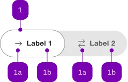
What does the component do?
It is part of the toggle component.
When should the component be used?
- Only within the toggle component.

| Number | Type | Description | Optional | Info |
|---|---|---|---|---|
| 1 | Component | sbb-toggle-option | No | |
| 1a | Component | sbb-icon | Yes | |
| 1b | Text | Label | Yes |
Examples
The sbb-toggle-option component is used inside the
sbb-toggle in order to render the toggle's options.
<sbb-toggle-option value="Value">Option</sbb-toggle-option>
Slots
It is possible to provide a label via an unnamed slot; the component can optionally display a sbb-icon
at the component start using the iconName property or via custom content using the icon slot.
Text and icon are not exclusive and can be used together.
<sbb-toggle-option value="Value" icon-name="app-icon-small"></sbb-toggle-option>

<sbb-toggle-option value="Value" icon-name="app-icon-small">Option</sbb-toggle-option>
States
The component can be displayed in checked or disabled states using the self-named properties.
<sbb-toggle-option value="Value" checked>Option</sbb-toggle-option>

<sbb-toggle-option value="Value" disabled>Option</sbb-toggle-option>
Properties
| Name | Attribute | Privacy | Type | Default | Description |
|---|---|---|---|---|---|
checked | checked | public | boolean | false | Whether the toggle-option is checked. |
disabled | disabled | public | boolean | false | Whether the toggle option is disabled. |
iconName | icon-name | public | string | undefined | The icon name we want to use, choose from the small icon variants from the ui-icons category from here https://icons.app.sbb.ch. | |
value | value | public | string | '' | Value of toggle-option. |
Slots
| Name | Description |
|---|---|
| Use the unnamed slot to add content to the label of the toggle option. | |
icon | Slot used to render the sbb-icon. |