What does the component do?
A teaser is a preview that is intended to arouse users' curiosity and encourage them to click on further content or pages.
When should the component be used?
- To highlight and promote content, articles, products or services.
- To make users aware of further information or interesting content.
Rules
- Use a catchy and inviting headline and a short, interesting description.
- Do not use too many different teaser types and sizes on one page.
- Several teasers can be structured with one title.
Sibling Components

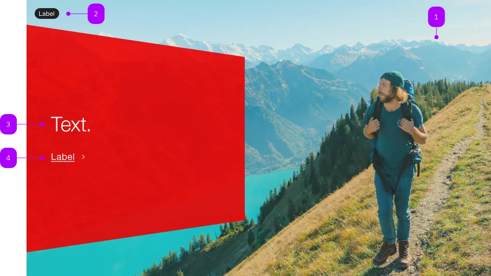
| Number | Type | Description | Optional | Info |
|---|---|---|---|---|
| 1 | Component | sbb-image | No | |
| 2 | Component | sbb-chip | Yes | |
| 3 | Text | No | ||
| 4 | Text | Link-Text | No |
Playground
Examples
The sbb-teaser-hero is a component with a background image and an action call within a panel;
it should be an eye-catcher and should have an emotional effect on the user with its large image component.
Slots
It is possible to provide the panel label via an unnamed slot,
while the link text can be provided using the link-content slot or the linkContent property;
similarly, the background image can be provided using the image slot or the imageSrc property.
<sbb-teaser-hero
  href="https://www.sbb.ch"
  link-content="Find out more"
  image-src="https://path-to-source"
  image-alt="SBB CFF FFS Employee"
>
  Break out and explore castles and palaces.
</sbb-teaser-hero>

<sbb-teaser-hero href="https://www.sbb.ch">
  Break out and explore castles and palaces.
  <sbb-image slot="image" image-src="https://path-to-source" alt="SBB CFF FFS Employee"></sbb-image>
  <span slot="link-content">Find out more</span>
</sbb-teaser-hero>
Accessibility
The description text is wrapped into an p element to guarantee the semantic meaning.
Avoid slotting block elements (e.g. div) as this violates semantic rules and can have negative effects on screen readers.
Properties
| Name | Attribute | Privacy | Type | Default | Description |
|---|---|---|---|---|---|
imageAlt | image-alt | public | string | undefined | Image alt text will be passed to sbb-image. | |
imageSrc | image-src | public | string | undefined | Image src will be passed to sbb-image. | |
linkContent | link-content | public | string | undefined | Panel link text. |
Slots
| Name | Description |
|---|---|
| Use the unnamed slot to add text content to the panel | |
image | The background image that can be a sbb-image |
link-content | Link content of the panel |