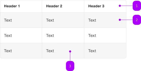
What does the component do?
The Table-Wrapper is a wrapper for a table. Its aim is to extend the native table functions.
When should the component be used?
- When using a native HTML table.
- If a styled table is required.
Rules
- Whenever a native HTML table is used. Especially if additional functions such as scrolling are required.

| Number | Type | Description | Optional | Info |
|---|---|---|---|---|
| 1 | Table-Header | Yes | ||
| 2 | Row | No | ||
| 3 | Column | No |
For working with tables, the native table and its related elements should be used.
With the sbb-table CSS class, styling the native element is possible.
The <sbb-table-wrapper> is a wrapper for a table. Its goal is to enhance/automate the native table capabilities.
<sbb-table-wrapper>
  <table class="sbb-table">
    <thead>
      ...
    </thead>
    <tbody>
      ...
    </tbody>
  </table>
</sbb-table-wrapper>
Style
See the Table style section.
Sticky Table
The <sbb-table-wrapper> provide classes and some utilities to implement a table with sticky header and columns.
It is the consumer responsibility to set the correct style/classes to the template.
Note: The Angular wrapper takes care of most of the sticky table setup. Please refer to the Lyne Angular examples.
Negative Table
The component has a negative variant which can be set with the self-named property.
Note: Due to technical limitations, consumer has to use set the negative property and the sbb-table--negative class.
<sbb-table-wrapper negative>
  <table class="sbb-table sbb-table--negative">
    ...
  </table>
</sbb-table-wrapper>
Accessibility
Always provide an accessible label for your tables via aria-label or aria-labelledby on the table element.
<sbb-table-wrapper>
  <table class="sbb-table" aria-label="Table caption">
    ...
  </table>
</sbb-table-wrapper>
Keyboard navigation
Please verify that the focus outline for keyboard navigation has the correct color.
E.g. when the table-wrapper is placed inside a dark container, the focus outline color should be set to dark
(--sbb-focus-outline-color: var(--sbb-focus-outline-color-dark)).
<div style="background: black; --sbb-focus-outline-color: var(--sbb-focus-outline-color-dark)">
  <sbb-table-wrapper>
    <table>
      ...
    </table>
  </sbb-table-wrapper>
</div>
API Documentation
class: SbbTableWrapperElement, sbb-table-wrapper
Properties
| Name | Attribute | Privacy | Type | Default | Description |
|---|---|---|---|---|---|
focusable | focusable | public | boolean | false | Whether the table wrapper is focusable. |
negative | negative | public | boolean | false | Negative coloring variant flag. |
Slots
| Name | Description |
|---|---|
| Use the unnamed slot to add the table. |