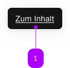
What does the component do?
Skip links are navigation aids that allow users to quickly jump to important content on a page, especially for screen reader users and keyboard navigation.
When should the component be used?
- To improve the accessibility of a website.
- When users need to get quickly to main content, menus or other important areas of the page.
- To allow users to skip long navigation sections and jump directly to relevant content.
Rules
- Make sure that skip links are placed as the first interactive elements in the DOM so that they are immediately accessible via the keyboard.
- Use clear and concise labelling for each skip link to clearly identify the target areas.
- Skip links should allow the user to jump directly to the relevant section of the page without additional content or navigation steps.

| Number | Type | Description | Optional | Info |
|---|---|---|---|---|
| 1 | Component | sbb-block-link | No | Es sind mehrere Links in der Liste erlaubt. Nur der jeweils fokussierte Link wird dargestellt. |
The <sbb-skiplink-list> is a component that can be used to collect one or more hidden sbb-block-links,
which become visible only when focused, e.g., using the Tab key.
When the component contains multiple link elements, only one of them is shown (the focused one), while the others stay visually hidden.
It has an optional <sbb-title> element, which is visually hidden too, but it's read from screen-readers,
and it can be set using the title-content property.
<sbb-skiplink-list title-level="2" title-content="Title text">
  <sbb-block-link href="https://www.sbb.ch/">Content</sbb-block-link>
  <sbb-block-link href="https://www.sbb.ch/en/help-and-contact.html">Contact</sbb-block-link>
  ...
</sbb-skiplink-list>
API Documentation
class: SbbSkiplinkListElement, sbb-skiplink-list
Properties
| Name | Attribute | Privacy | Type | Default | Description |
|---|---|---|---|---|---|
titleContent | title-content | public | string | '' | The title text we want to place before the list. |
titleLevel | title-level | public | SbbTitleLevel | '2' | The semantic level of the title, e.g. 2 = h2. |
CSS Properties
| Name | Default | Description |
|---|---|---|
--sbb-skiplink-list-z-index | var(--sbb-overlay-default-z-index) | To specify a custom stack order, the z-index can be overridden by defining this CSS variable. The default z-index of the component is set to var(--sbb-overlay-default-z-index) with a value of 1000. |
Slots
| Name | Description |
|---|---|
Use the unnamed slot to add sbb-block-link/sbb-block-link-button elements to the sbb-skiplink-list. | |
title | Use this to provide a title for the skiplink-list (optional). |