Zur Navigation Zum Inhalt Kontakt Menu Find component Overview Lyne Principles Foundation Accessibility Design System Guidelines Deutsch Français Italiano English Our design principles User-centred Recognisable Inclusive Reduced Holistic Self-explanatory Task-oriented Appropriate SBB Brand portal Logo Digital clock Rights of use Base colors Functional colors Off brand colors Icons Timetable icons Pictograms About accessibility Über diesen Guide Contact Further information Product Owner User Research Interaction Design Visual Design Development Content Design Testing What is a design system? Designing Coding FAQ Help Process Contribution Contact Overview Base Components Overview Releases Design Tokens Komponenten Overview Base Informationen Overview Base Components Sense & Purpose Community Assets Instructions Power-Apps Digital banner ads SAP Design Guidelines App Icons Navigation-List Info

What does the component do?

It is part of the navigation component.

When should the component be used?

  • Only within the navigation component.

Parent Components

Navigation-Section

Child Components

Navigation-ButtonNavigation-Link
Anatomy
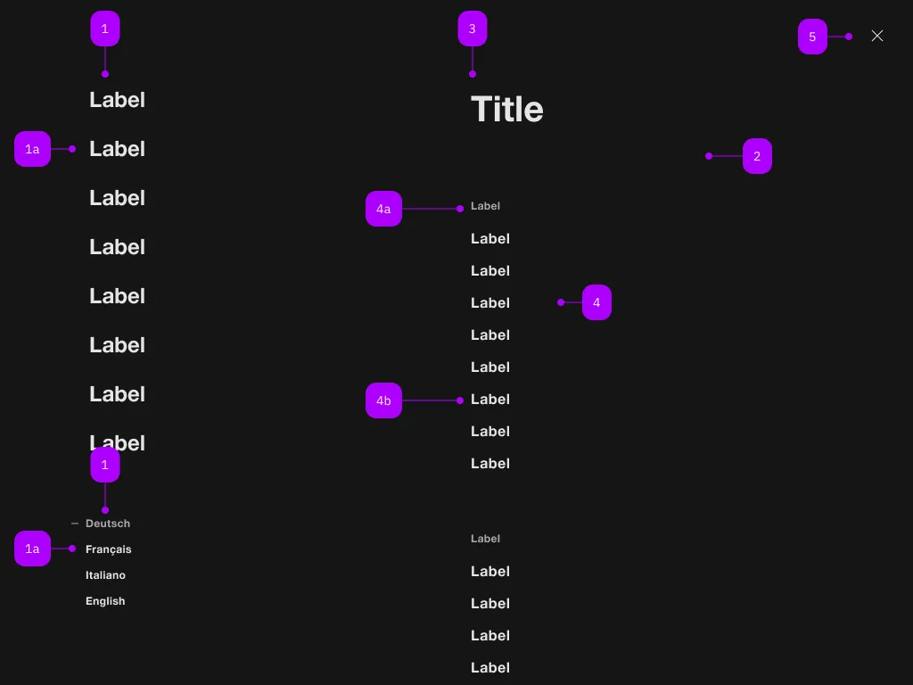
Anatomy of the component
Number Type Description Optional Info
1 Component sbb-navigation-marker No
1a Component sbb-navigation-link oder sbb-navigation-button No
2 Component sbb-navigation-section No
3 Text Label No
4 Component sbb-navigation-list No
4a Text Label No
4b Component sbb-navigation-link oder sbb-navigation-button No
5 Component sbb-transparent-button No
Demo

Examples

Default
Slotted Label
HTML-Markup kopiert.
Implementation

The sbb-navigation-list component is a collection of sbb-navigation-button
and sbb-navigation-link.
Its intended use is inside a sbb-navigation-section component.
Optionally, a label can be provided via slot via the self-named property or the self-named slot.

<sbb-navigation-list label="Label 1.1">
  <sbb-navigation-link href="...">Label 1.1.1</sbb-navigation-link>
  <sbb-navigation-link href="...">Label 1.1.2</sbb-navigation-link>
  <sbb-navigation-button>Label 1.1.3</sbb-navigation-link>
</sbb-navigation-list>

Properties

Name Attribute Privacy Type Default Description
label label public string | undefined The label to be shown before the action list.

Slots

Name Description
Use the unnamed slot to add content to the sbb-navigation-list.
label Use this to provide a label element.
Imprint Contact Cookie settings