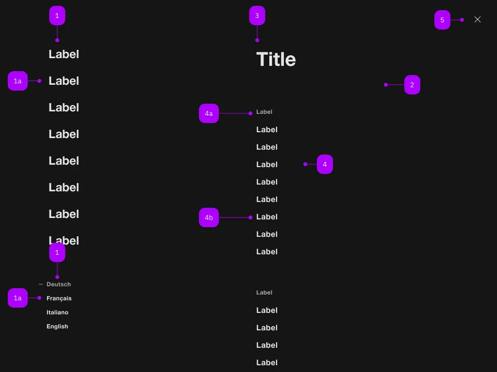
What does the component do?
It is part of the navigation component.
When should the component be used?
- Only within the navigation component.

| Number | Type | Description | Optional | Info |
|---|---|---|---|---|
| 1 | Component | sbb-navigation-marker | No | |
| 1a | Component | sbb-navigation-link oder sbb-navigation-button | No | |
| 2 | Component | sbb-navigation-section | No | |
| 3 | Text | Label | No | |
| 4 | Component | sbb-navigation-list | No | |
| 4a | Text | Label | No | |
| 4b | Component | sbb-navigation-link oder sbb-navigation-button | No | |
| 5 | Component | sbb-transparent-button | No |
Examples
The sbb-navigation-button component is an action element contained by
a sbb-navigation-list component
or a sbb-navigation-marker component.
Button properties
The component is internally rendered as a button,
accepting its associated properties (type, name, value and form).
<sbb-navigation-button value="menu" name="menu">Button</sbb-navigation-button>
State
The navigation button can have an initial active state which can be set by using the class .sbb-active.
<sbb-navigation-button class="sbb-active" value="menu" name="menu">Button</sbb-navigation-button>
Style
The component has three different sizes, which can be changed using the size property (l, which is the default, m and s).
<sbb-navigation-button value="menu" name="menu" size="m">Button</sbb-navigation-button>
Properties
| Name | Attribute | Privacy | Type | Default | Description |
|---|---|---|---|---|---|
connectedSection | - | public | SbbNavigationSectionElement | undefined | The section that is beign controlled by the action, if any. | |
form | form | public | string | undefined | The | |
marker | - | public | SbbNavigationMarkerElement | null | The navigation marker in which the action is nested. | |
name | name | public | string | The name of the button element. | |
section | - | public | SbbNavigationSectionElement | null | The section in which the action is nested. | |
size | size | public | SbbNavigationActionSize | undefined | 'l' | Action size variant. |
type | type | public | SbbButtonType | 'button' | The type attribute to use for the button. |
value | value | public | string | The value of the button element. |
Slots
| Name | Description |
|---|---|
Use the unnamed slot to add content to the sbb-navigation-button. |