What does the component do?
A message is a notification that informs users about information, successes, errors or other events in the application. Unlike a notification, it has no status and no option to hide itself. It is integrated into the layout and is suitable in particular for notifications within lists.
When should the component be used?
- To inform users about actions, e.g. success or error messages.
- In contrast to the Alert or Notification component, it generates less attention.
- It is well suited for messages in empty lists, for example.
Rules
- The message must be integrated into the layout and should not be positioned like the alert or notification component.

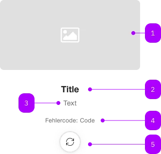
| Number | Type | Description | Optional | Info |
|---|---|---|---|---|
| 1 | Component | sbb-image | Yes | |
| 2 | Component | sbb-title | No | |
| 3 | Text | Subtitle | Yes | |
| 4 | Text | Legend | Yes | |
| 5 | Component | sbb-secondary-button | Yes |
Playground
Please reload the page or try your search again later.
Error code: 0001
The <sbb-message> component can be used to display a complex message.
Slots
The title slot should be used to slot a <sbb-title> element.
Optionally, the user can provide other elements such as a subtitle paragraph via the subtitle slot,
a sbb-image to provide an image via the image slot,
a paragraph to provide an error code via the legend slot,
and a sbb-button to provide a custom action via the action slot.
<sbb-message>
  <sbb-image slot="image" [...]></sbb-image>
  <sbb-title slot="title" level="3">Title</sbb-title>
  <p slot="subtitle">Subtitle</p>
  <p slot="legend">Error code: 0001</p>
  <sbb-button slot="action" [...]>Action</sbb-button>
</sbb-message>
API Documentation
class: SbbMessageElement, sbb-message
Slots
| Name | Description |
|---|---|
action | Use this slot to provide an sbb-secondary-button. |
image | Use this slot to provide an sbb-image component. |
legend | Use this slot to provide a legend, must be a paragraph. |
subtitle | Use this slot to provide a subtitle, must be a paragraph. |
title | Use this slot to provide an sbb-title. |