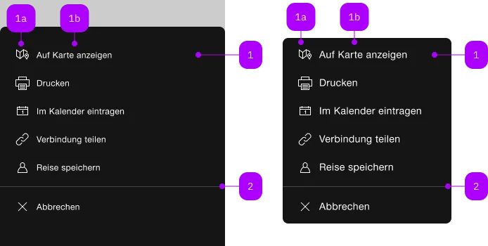
What does the component do?
It is part of the menu component.
When should the component be used?
- Only within the menu component.
Child Components

| Number | Type | Description | Optional | Info |
|---|---|---|---|---|
| 1 | Component | sbb-menu-button oder sbb-menu-link | No | |
| 1a | Component | sbb-icon | No | |
| 1b | Text | Label | Yes | |
| 2 | Component | sbb-divider | Yes |
Examples
The component represents a button element contained by the sbb-menu component.
Slots
It is possible to provide a label via an unnamed slot; the component can optionally display a sbb-icon
at the component start using the iconName property or via custom content using the icon slot.
<sbb-menu-button>Text</sbb-menu-button>

<sbb-menu-button icon-name="pie-small">Another text</sbb-menu-button>
An amount can be rendered at the end of the action element as white text in a red circle via the amount property.
<sbb-menu-button amount="123">Amount text</sbb-menu-button>
Button properties
The component is internally rendered as a button,
accepting its associated properties (type, name, value and form).
<sbb-menu-button value="menu" name="menu">Button</sbb-menu-button>
Properties
| Name | Attribute | Privacy | Type | Default | Description |
|---|---|---|---|---|---|
amount | amount | public | string | undefined | Value shown as badge at component end. | |
disabled | disabled | public | boolean | false | Whether the component is disabled. |
form | form | public | string | undefined | The | |
iconName | icon-name | public | string | undefined | The icon name we want to use, choose from the small icon variants from the ui-icons category from here https://icons.app.sbb.ch. | |
name | name | public | string | The name of the button element. | |
type | type | public | SbbButtonType | 'button' | The type attribute to use for the button. |
value | value | public | string | The value of the button element. |
CSS Properties
| Name | Default | Description |
|---|---|---|
--sbb-menu-action-outer-horizontal-padding | var(--sbb-spacing-fixed-3x) | Can be used to modify horizontal padding. |
Slots
| Name | Description |
|---|---|
Use the unnamed slot to add content to the sbb-menu-button. | |
icon | Use this slot to provide an icon. If icon-name is set, a sbb-icon will be used. |