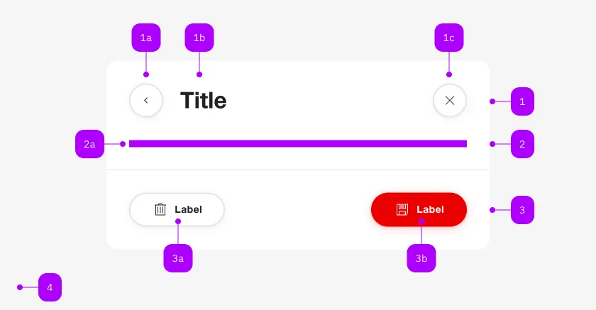
What does the component do?
It is part of the dialog component.
When should the component be used?
- Only within the dialog component.
Parent Components

| Number | Type | Description | Optional | Info |
|---|---|---|---|---|
| 1 | Component | sbb-dialog-title | No | |
| 1a | Component | sbb-secondary-button | Yes | Back-Button |
| 1b | Component | sbb-secondary-button | No | |
| 1c | Component | sbb-secondary-button | Yes | Close-Action |
| 2 | Component | sbb-title | No | |
| 2a | Slot | Beliebiger Inhalt erlaubt | No | |
| 3 | Component | sbb-dialog-actions | Yes | |
| 3a | Component | sbb-secondary-button | Yes | Auch Block-Links sind erlaubt |
| 3b | Component | sbb-button | Yes | Auch Block-Links sind erlaubt |
The sbb-dialog-title component extends the sbb-title component. Use it in combination with the sbb-dialog to display a header in the dialog with a title, a close button and an optional back button.
<sbb-dialog>
  <sbb-dialog-title
    back-button
    accessibility-close-label="Close button"
    accessibility-back-label="Back button"
  >
    A describing title of the dialog
  </sbb-dialog-title>
</sbb-dialog>
States
The title can have a negative state which is automatically synchronized with the negative state of the dialog.
In addition, the title can be hidden when scrolling down the content, to provide more space for reading the content itself; this can be done thanks to the hide-on-scroll property, which can determine whether to hide the title and up to which breakpoint.
<sbb-dialog>
  <sbb-dialog-title hide-on-scroll="small">A describing title of the dialog</sbb-dialog-title>
</sbb-dialog>
Interactions
A close button is always displayed and can be used to close the dialog. Optionally, a back button can be shown with the property back-button (default is false). Note that setting an accessibilityBackLabel will also display a back button.
<sbb-dialog>
  <sbb-dialog-title back-button>A describing title of the dialog</sbb-dialog-title>
</sbb-dialog>
Events
If a back button is displayed it emits a requestBackAction event on click.
Properties
| Name | Attribute | Privacy | Type | Default | Description |
|---|---|---|---|---|---|
accessibilityBackLabel | accessibility-back-label | public | | string | undefined | This will be forwarded as aria-label to the back button element. | |
accessibilityCloseLabel | accessibility-close-label | public | | string | undefined | This will be forwarded as aria-label to the close button element. | |
backButton | back-button | public | boolean | false | Whether a back button is displayed next to the title. |
hideOnScroll | hide-on-scroll | public | Breakpoint | boolean | false | Whether to hide the title up to a certain breakpoint. |
level | level | public | SbbTitleLevel | '2' | Title level |
negative | negative | public | boolean | false | Negative coloring variant flag. |
visualLevel | visual-level | public | SbbTitleLevel | undefined | '3' | Visual level for the title. Optional, if not set, the value of level will be used. |
visuallyHidden | visually-hidden | public | boolean | undefined | Sometimes we need a title in the markup to present a proper hierarchy to the screen readers while we do not want to let that title appear visually. In this case we set visuallyHidden to true. |
Events
| Name | Type | Description | Inherited From |
|---|---|---|---|
requestBackAction | CustomEvent<void> | Emits whenever the back button is clicked. |
Slots
| Name | Description |
|---|---|
| Use the unnamed slot to display the title. |