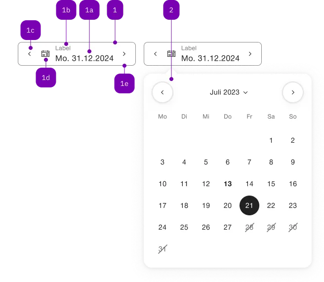
What does the component do?
It is part of the date-picker component.
When should the component be used?
- Only within the date-picker component.
Parent Components

| Number | Type | Description | Optional | Info |
|---|---|---|---|---|
| 1 | Component | sbb-form-field | No | |
| 1a | Standard-HTML | input | No | |
| 1b | Standard-HTML | label | No | |
| 1c | Component | sbb-datepicker-previous-day | Yes | |
| 1d | Component | sbb-datepicker-toggle | Yes | |
| 1e | Component | sbb-datepicker-next-day | Yes | |
| 2 | Component | sbb-datepicker | No |
Examples
The sbb-datepicker-toggle is a component
closely connected to the sbb-datepicker.
When the two are used together, the sbb-datepicker-toggle can be used to link the sbb-datepicker
to a sbb-calendar:
a change in the latter, like selecting a date, is propagated to the former; and conversely, changes in the sbb-datepicker
properties, or in the date-picker's input attributes, are propagated to the sbb-calendar to modify its appearance.
The components can be connected using the datePicker property, which accepts the id of the sbb-datepicker,
or directly its reference.
<sbb-datepicker-toggle date-picker="datepicker"></sbb-datepicker-toggle>
<input id="datepicker-input" />
<sbb-datepicker input="datepicker-input" id="datepicker"></sbb-datepicker>
In sbb-form-field
If the two components are used within a sbb-form-field,
they are automatically linked and the sbb-datepicker-toggle will be projected in the prefix slot of the sbb-form-field;
otherwise, they can be connected using the datePicker property as described above.
<sbb-form-field>
  <sbb-datepicker-toggle></sbb-datepicker-toggle>
  <input />
  <sbb-datepicker></sbb-datepicker>
</sbb-form-field>
NOTE: Since the component needs the sbb-datepicker to work properly,
both standalone or within the sbb-form-field, they must have the same parent element to be correctly connected.
Properties
| Name | Attribute | Privacy | Type | Default | Description |
|---|---|---|---|---|---|
datePicker | date-picker | public | string | SbbDatepickerElement | undefined | Datepicker reference. | |
negative | negative | public | boolean | false | Negative coloring variant flag. |
Methods
| Name | Privacy | Description | Parameters | Return | Inherited From |
|---|---|---|---|---|---|
open | public | Opens the calendar. | void |