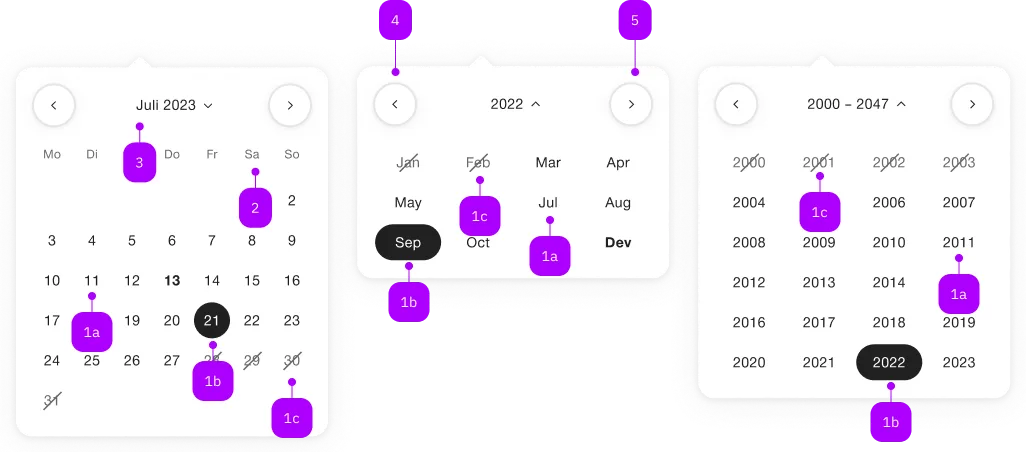
What does the component do?
A calendar is a component that allows users to display and select date information.
When should the component be used?
- To provide users with an easy way to view and manage date-dependent information like appointments.
- To enable the selection of date ranges for bookings or planning.
- To display recurring events and their patterns.
Rules
- Individual months or entire years can be displayed.
- If the calendar is used in the date picker, only one date can be selected.
- If the calendar is used standalone, several dates can be selected.
- Individual days can have several statuses.

| Number | Type | Description | Optional | Info |
|---|---|---|---|---|
| 1a | – | Tag, Monat, Jahr, gewählt | No | |
| 1b | – | Tag, Monat, Jahr, default | No | |
| 1b | – | Tag, Monat, Jahr, disabled | Yes | |
| 2 | – | Wochentage | No | |
| 3 | – | Monat/Jahr/Jahre (inkl. Switcher) | No | |
| 4 | – | Vorheriger Monat | Yes | |
| 5 | – | Nächster Monat | Yes |
Playground
Examples
The sbb-calendar component displays a calendar that allows the user to select a date.
While being deeply linked to the implementation of the sbb-datepicker-toggle component,
it can be used on its own.
<sbb-calendar></sbb-calendar>
It's possible to set a date using the dateSelected property. Also, it's possible to place limits on the selection
using the two properties named min and max. For these three properties, the accepted formats are:
- Date objects
- ISO String
- Unix Timestamp (number of seconds since Jan 1, 1970)
It's recommended to set the time to 00:00:00.
<sbb-calendar min="1600000000" max="1700000000" selected="1650000000"></sbb-calendar>
To simulate the current date, you can use the now property,
which accepts a Date or a timestamp in seconds (as number or string).
This is helpful if you need a specific state of the component.
Style
The component displays one month by default; two months can be displayed setting the wide property to true.
<sbb-calendar wide="true" selected="1650000000"></sbb-calendar>
It's also possible to filter out unwanted date using the dateFilter function property.
Note that using the dateFilter function as a replacement for the min and max properties will most likely result in a significant loss of performance.
Events
Consumers can listen to the dateSelected event on the sbb-calendar component to intercept the selected date
which can be read from event.detail.
Keyboard interaction
It's possible to move within the component using the keyboard.
| Keyboard | Action |
|---|---|
| Left Arrow | Go to previous day. |
| Right Arrow | Go to next day. |
| Up Arrow | Go to the same day in the previous week. |
| Down Arrow | Go to the same day in the next week. |
| Home | Go to the first day of the month. |
| End | Go to the last day of the month. |
| Page Up | Go to the top of the column of the currently selected day. |
| Page Down | Go to the bottom of the column of the currently selected day. |
Accessibility
For accessibility purposes, the component is rendered as a native table element and each day is a button.
Properties
| Name | Attribute | Privacy | Type | Default | Description |
|---|---|---|---|---|---|
dateFilter | date-filter | public | (date: T | null) => boolean | undefined | A function used to filter out dates. | |
max | max | public | T | null | The maximum valid date. Takes T Object, ISOString, and Unix Timestamp (number of seconds since Jan 1, 1970). | |
min | min | public | T | null | The minimum valid date. Takes T Object, ISOString, and Unix Timestamp (number of seconds since Jan 1, 1970). | |
now | now | public | T | null | A configured date which acts as the current date instead of the real current date. Recommended for testing purposes. |
selected | selected | public | T | null | The selected date. Takes T Object, ISOString, and Unix Timestamp (number of seconds since Jan 1, 1970). | |
wide | wide | public | boolean | false | If set to true, two months are displayed |
Methods
| Name | Privacy | Description | Parameters | Return | Inherited From |
|---|---|---|---|---|---|
resetPosition | public | Resets the active month according to the new state of the calendar. | void |
Events
| Name | Type | Description | Inherited From |
|---|---|---|---|
dateSelected | CustomEvent<T> | Event emitted on date selection. |