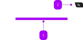
What does the component do?
It is part of the card component.
When should the component be used?
- Only within the card component.
Parent Components

| Number | Type | Description | Optional | Info |
|---|---|---|---|---|
| 1 | Slot | Beliebiger Inhalt erlaubt | No | |
| 2 | Component | sbb-card-badge | Yes |
The sbb-card-button is the component used to turn a sbb-card into a button.
<sbb-card-button type="submit" form="buy" value="trip">Buy this trip!</sbb-card-button>
Button properties
The component is internally rendered as a button,
accepting its associated properties (type, name, value and form).
Accessibility
It's important that a descriptive message is being slotted into the unnamed slot of sbb-card-button
as it is used for search engines and screen-reader users.
<sbb-card-button>Buy a half-fare ticket now</sbb-card-button>
Properties
| Name | Attribute | Privacy | Type | Default | Description |
|---|---|---|---|---|---|
active | active | public | boolean | false | Whether the card is active. |
form | form | public | string | undefined | The | |
name | name | public | string | The name of the button element. | |
type | type | public | SbbButtonType | 'button' | The type attribute to use for the button. |
value | value | public | string | The value of the button element. |
Slots
| Name | Description |
|---|---|
| Use the unnamed slot to add a descriptive label / title of the button (important!). This is relevant for SEO and screen readers. |