What does the component do?
A button is an interactive element that triggers an action when it is clicked.
When should the component be used?
- To perform a primary or secondary action on a page.
- To enable the user to submit forms.
- To enable interactions for example opening dialogues or navigating to another page.
Rules
- A button should be clearly labelled and describe a specific action.

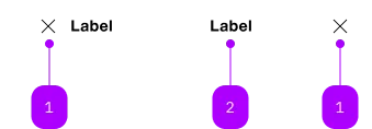
| Number | Type | Description | Optional | Info |
|---|---|---|---|---|
| 1 | Component | sbb-icon | Yes | Ein Icon oder ein Label ist zu setzen. |
| 2 | Text | Label | Yes | Ein Icon oder ein Label ist zu setzen. |
Playground
Examples
The sbb-transparent-button-link component provides the same functionality as a native <a>,
despite its appearance as a button enhanced with the SBB Design in the 'transparent' variant.
<sbb-transparent-button-link href="https://www.sbb.ch">Button text</sbb-transparent-button-link>
Slots
The text is provided via an unnamed slot; the component can optionally display a sbb-icon
at the component start using the iconName property or via custom content using the icon slot.
At least one is mandatory, so you can have a sbb-transparent-button-link with icon only, text only, or with both.
<sbb-transparent-button-link href="https://www.sbb.ch" icon-name="info">
  Button text
</sbb-transparent-button-link>

<sbb-transparent-button-link href="https://www.sbb.ch">
  <sbb-icon slot="icon" name="info"></sbb-icon>
  Button text
</sbb-transparent-button-link>

<sbb-transparent-button-link
  href="https://www.sbb.ch"
  icon-name="info"
  accessibility-label="Click for more information."
></sbb-transparent-button-link>
Link properties
The component is internally rendered as a link,
accepting its associated properties (href, target, rel and download).
<sbb-transparent-button-link
  href="https://github.com/sbb-design-systems/lyne-components"
  target="_blank"
>
  Go to site
</sbb-transparent-button-link>
Style
The component has a negative variant which can be set using the negative property.
There are two different sizes (m and l, which is the default) that can be set using the size property.
The component can be displayed in disabled state using the self-named property.
<sbb-transparent-button-link href="https://www.sbb.ch" negative>Button</sbb-transparent-button-link>

<sbb-transparent-button-link href="https://www.sbb.ch" size="m">Button</sbb-transparent-button-link>

<sbb-transparent-button-link href="https://www.sbb.ch" disabled>Button</sbb-transparent-button-link>
Focus outline
Please make sure that the focus outline appears in the correct color if the component is used on a dark background.
You can set it by re-defining the css var on sbb-transparent-button-link or any parent element:
sbb-transparent-button-link {
  --sbb-focus-outline-color: var(--sbb-focus-outline-color-dark);
}
Accessibility
Use the accessibility properties in case of an icon-only button to describe the purpose of the sbb-transparent-button-link for screen-reader users.
Properties
| Name | Attribute | Privacy | Type | Default | Description |
|---|---|---|---|---|---|
accessibilityLabel | accessibility-label | public | string | undefined | This will be forwarded as aria-label to the inner anchor element. | |
disabled | disabled | public | boolean | false | Whether the component is disabled. |
download | download | public | boolean | undefined | Whether the browser will show the download dialog on click. | |
href | href | public | string | undefined | The href value you want to link to. | |
iconName | icon-name | public | string | undefined | The icon name we want to use, choose from the small icon variants from the ui-icons category from here https://icons.app.sbb.ch. | |
negative | negative | public | boolean | false | Negative coloring variant flag. |
rel | rel | public | string | undefined | The relationship of the linked URL as space-separated link types. | |
size | size | public | SbbButtonSize | undefined | 'l' | Size variant, either l or m. |
target | target | public | LinkTargetType | string | undefined | Where to display the linked URL. |
Slots
| Name | Description |
|---|---|
| Use the unnamed slot to add content to the transparent-button-link. | |
icon | Slot used to display the icon, if one is set |