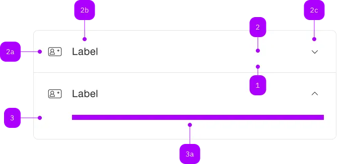
What does the component do?
It is part of the Accordion component.
When should the component be used?
- Only within the Accordion component.
Parent Components

| Number | Type | Description | Optional | Info |
|---|---|---|---|---|
| 1 | Component | sbb-extension-panel | No | |
| 2 | Component | sbb-expansion-panel-header | No | |
| 2a | Component | sbb-icon | Yes | |
| 2b | Text | Label | No | |
| 2c | Component | sbb-icon | No | Zeigt den Zustand an |
| 3 | Component | sbb-expansion-panel-content | No | |
| 3a | Slot | Beliebiger Inhalt erlaubt | No |
Examples
The sbb-expansion-panel-header is a component which is meant to be used as a header
in the sbb-expansion-panel,
acting as a control for an expanding / collapsing content, like a native <summary> tag.
<sbb-expansion-panel-header>Header</sbb-expansion-panel-header>
Slots
The component is internally rendered as a button, and it is possible to provide text via an unnamed slot.
On the left side, a toggle icon is displayed; it flips based on the host's aria-expanded property.
The component can optionally display a sbb-icon at the component start using the iconName
property or via custom content using the icon slot.
If using the SBB icons, the icon should be a medium size icon.
<sbb-expansion-panel-header icon-name="swisspass-medium">Header</sbb-expansion-panel-header>
States
The component can be displayed in disabled state using the self-named property.
<sbb-expansion-panel-header disabled>Header</sbb-expansion-panel-header>
Events
When the element is clicked, the toggleExpanded event is emitted.
Properties
| Name | Attribute | Privacy | Type | Default | Description |
|---|---|---|---|---|---|
disabled | disabled | public | boolean | false | Whether the component is disabled. |
form | form | public | string | undefined | The | |
iconName | icon-name | public | string | undefined | The icon name we want to use, choose from the small icon variants from the ui-icons category from here https://icons.app.sbb.ch. | |
name | name | public | string | The name of the button element. | |
type | type | public | SbbButtonType | 'button' | The type attribute to use for the button. |
value | value | public | string | The value of the button element. |
Events
| Name | Type | Description | Inherited From |
|---|---|---|---|
toggleExpanded | CustomEvent<void> | Notifies that the sbb-expansion-panel has to expand. |
Slots
| Name | Description |
|---|---|
Use the unnamed slot to add content to the sbb-expansion-panel-header. | |
icon | Slot used to render the sbb-expansion-panel-header icon. |