What does the component do?
It is part of the Accordion component.
When should the component be used?
- Only within the Accordion component.
Parent Components

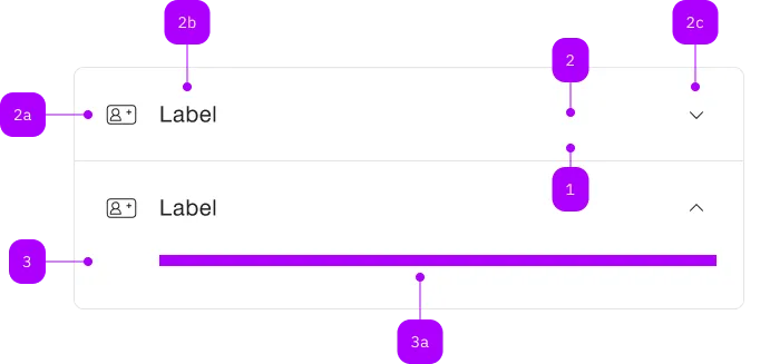
| Number | Type | Description | Optional | Info |
|---|---|---|---|---|
| 1 | Component | sbb-extension-panel | No | |
| 2 | Component | sbb-expansion-panel-header | No | |
| 2a | Component | sbb-icon | Yes | |
| 2b | Text | Label | No | |
| 2c | Component | sbb-icon | No | Zeigt den Zustand an |
| 3 | Component | sbb-expansion-panel-content | No | |
| 3a | Slot | Beliebiger Inhalt erlaubt | No |
Examples
The sbb-expansion-panel-content is a component which acts as a container for any element
that needs to be displayed in a sbb-expansion-panel.
<sbb-expansion-panel-content>
  <p>Lorem ipsum dolor sit amet, consectetur adipiscing elit.</p>
  <p>
    <span> Donec porttitor blandit odio, ut blandit libero cursus vel. </span>
    <span>
      Nunc eu congue mauris. Quisque sed facilisis leo. Curabitur malesuada, nibh ac blandit
      vehicula, urna sem scelerisque magna, sed tincidunt neque arcu ac justo.
    </span>
  </p>
</sbb-expansion-panel-content>
Style
When it's used in combination with a sbb-expansion-panel-header with an icon displayed via slot or iconName property,
the sbb-expansion-panel-content receives a padding on the left side in order to align it with the header label.
Slots
| Name | Description |
|---|---|
Use the unnamed slot to add content to the sbb-expansion-panel. |