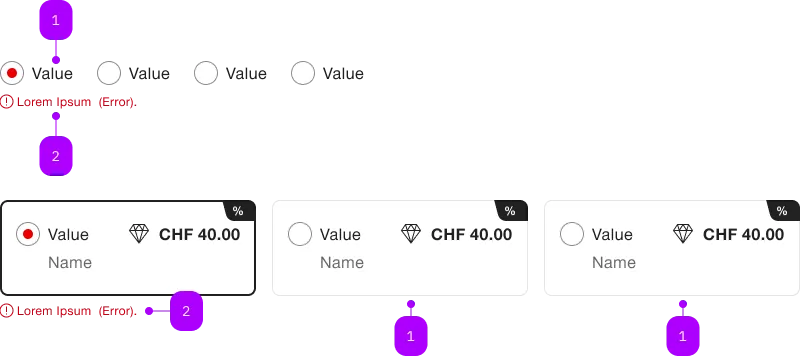
Was macht die Komponente?
Sie gewährleistet das Layout bei einer Gruppe von Radiobuttons.
Wann soll die Komponente eingesetzt werden?
- Nur in Kombination mit der Radiobutton-Komponente.
Enthaltene Komponenten

| Nummer | Typ | Beschreibung | Optional | Hinweis |
|---|---|---|---|---|
| 1a | Komponente | sbb-radiobutton |
Nein | checked |
| 1b | Komponente | sbb-radiobutton |
Nein | unchecked |
| 2 | Error | sbb-form-error |
– |
Spielwiese
Beispiele
The sbb-radio-button-group is a component which can be used as a wrapper for
a collection of either sbb-radio-buttons, sbb-radio-button-panels,
or sbb-selection-expansion-panels.
<!-- The first option will be selected by default -->
<sbb-radio-button-group value="Value one" aria-label="Radio group label">
  <sbb-radio-button value="Value one">Option one</sbb-radio-button>
  <sbb-radio-button value="Value two">Option two</sbb-radio-button>
  <sbb-radio-button value="Value three">Option three</sbb-radio-button>
</sbb-radio-button-group>
Pressing a sbb-radio-button checks it and unchecks the previously selected one, if any.
They can also be controlled programmatically by setting the value property of the parent radio group to the value of the radio.
Please note that within a sbb-radio-button-group, only one sbb-radio-button can be selected at a time;
if you need to select more than one item, it is recommended to use the sbb-checkbox-group component.
States
The radio group can have different states:
- can be completely disabled by setting the property
disabled; - can be required by setting the property
required.
<!-- All child radio buttons will be disabled -->
<sbb-radio-button-group value="Value one" aria-label="Radio group label" disabled>
  ...
</sbb-radio-button-group>

<!-- The radio group and all child radio buttons will be marked as required -->
<sbb-radio-button-group value="Value one" aria-label="Radio group label" required>
  ...
</sbb-radio-button-group>
In order to deselect a sbb-radio-button inside the sbb-radio-button-group,
you can use the allowEmptySelection property, which will be proxied to the inner sbb-radio-button
enabling their deselection (by default, a selected sbb-radio-button cannot be deselected).
<sbb-radio-button-group allow-empty-selection> ... </sbb-radio-button-group>
Style
The orientation property is used to set item orientation. Possible values are horizontal (default) and vertical.
The optional property horizontalFrom can be used in combination with orientation='vertical' to
indicate the minimum breakpoint from which the orientation changes to horizontal.
<sbb-radio-button-group orientation="vertical" horizontal-from="large">
  ...
</sbb-radio-button-group>
Events
Consumers can listen to the native change/input event on the sbb-radio-button-group component
to intercept the selection's change; the current value can be read from event.detail.value.
Accessibility
In order to ensure readability for screen-readers, please provide an aria-label attribute for the sbb-radio-button-group.
Properties
| Name | Attribute | Privacy | Type | Default | Description |
|---|---|---|---|---|---|
allowEmptySelection |
allow-empty-selection |
public | boolean |
false |
Whether the radios can be deselected. |
disabled |
disabled |
public | boolean |
false |
Whether the component is disabled. |
horizontalFrom |
horizontal-from |
public | SbbHorizontalFrom | undefined |
Overrides the behaviour of orientation property. |
|
orientation |
orientation |
public | SbbOrientation |
'horizontal' |
Radio group's orientation, either horizontal or vertical. |
radioButtons |
- | public | (SbbRadioButtonElement | SbbRadioButtonPanelElement)[] |
List of contained radio buttons. | |
required |
required |
public | boolean |
false |
Whether the radio group is required. |
size |
size |
public | SbbRadioButtonSize |
'm' |
Size variant, either m or s. |
value |
value |
public | any | null | undefined |
The value of the radio group. |
Events
| Name | Type | Description | Inherited From |
|---|---|---|---|
change |
CustomEvent<SbbRadioButtonGroupEventDetail> |
Emits whenever the sbb-radio-group value changes. |
|
didChange |
CustomEvent<SbbRadioButtonGroupEventDetail> |
Deprecated. Only used for React. Will probably be removed once React 19 is available. Emits whenever the sbb-radio-group value changes. |
|
input |
CustomEvent<SbbRadioButtonGroupEventDetail> |
Emits whenever the sbb-radio-group value changes. |
Slots
| Name | Description |
|---|---|
Use the unnamed slot to add sbb-radio-button elements to the sbb-radio-button-group. |
|
error |
Use this to provide a sbb-form-error to show an error message. |