Was macht die Komponente?
Sie ist Teil der Accordion-Komponente.
Wann soll die Komponente eingesetzt werden?
- Nur innerhalb der Accordion-Komponente.
Übergeordnete Komponenten
Enthaltene Komponenten

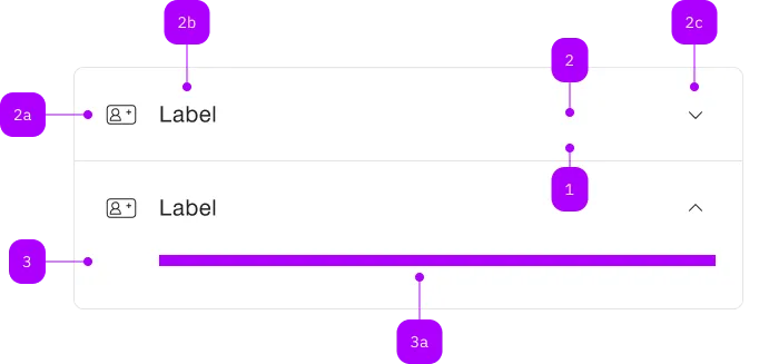
| Nummer | Typ | Beschreibung | Optional | Hinweis |
|---|---|---|---|---|
| 1 | Komponente | sbb-extension-panel |
Nein | |
| 2 | Komponente | sbb-expansion-panel-header |
Nein | |
| 2a | Komponente | sbb-icon |
Ja | |
| 2b | Text | Label | Nein | |
| 2c | Komponente | sbb-icon |
Nein | Zeigt den Zustand an |
| 3 | Komponente | sbb-expansion-panel-content |
Nein | |
| 3a | Slot | Beliebiger Inhalt erlaubt | Nein |
Spielwiese
Beispiele
The sbb-expansion-panel is a component which acts as an expandable summary-details widget.
It can be used standalone or inside a sbb-accordion.
Slots
In order to correctly display the component, it must be used together with
a sbb-expansion-panel-header
and a sbb-expansion-panel-content;
the first will work as a state controller, the last will act as the expandable content.
These two components automatically fill the two available slots, named header and content.
<sbb-expansion-panel>
  <sbb-expansion-panel-header>This is the header.</sbb-expansion-panel-header>
  <sbb-expansion-panel-content>This is the content.</sbb-expansion-panel-content>
</sbb-expansion-panel>
States
The visibility of the content is controlled by the value of the expanded property.
<sbb-expansion-panel expanded> ... </sbb-expansion-panel>
The disabled state can be set using the self-named variable. In this state, the component can not be collapsed or expanded.
<sbb-expansion-panel disabled> ... </sbb-expansion-panel>
Style
The component has two background options (milk and white, which is the default) that can be set using the color variable.
<sbb-expansion-panel color="milk"> ... </sbb-expansion-panel>
The component has two different sizes, l (default) and s, which can be changed using the size property.
The property is overridden when the component is used within a sbb-accordion.
<sbb-expansion-panel size="s"> ... </sbb-expansion-panel>
It's also possible to display the sbb-expansion-panel without border by setting the borderless variable.
<sbb-expansion-panel borderless> ... </sbb-expansion-panel>
Using the titleLevel variable, it's possible to wrap the sbb-expansion-panel-header in a heading tag;
if it's unset, a <div> is used as a wrapper.
<sbb-expansion-panel level="4">
  <sbb-expansion-panel-header
    >This is the header, and it will be wrapped in a h4 tag.</sbb-expansion-panel-header
  >
  <sbb-expansion-panel-content>This is the content.</sbb-expansion-panel-content>
</sbb-expansion-panel>
Accessibility
When the sbb-expansion-panel-header and the sbb-expansion-panel-content are slotted into the component,
they both receive an id, if not set; then, the content's id is set as aria-controls attribute of the header,
and the header's id is set as aria-labelledby attribute on the content.
The expanded attribute is used to correctly set the aria-expanded attribute on the header
and the aria-hidden attribute on the content.
Properties
| Name | Attribute | Privacy | Type | Default | Description |
|---|---|---|---|---|---|
borderless |
borderless |
public | boolean |
false |
Whether the panel has no border. |
color |
color |
public | 'white' | 'milk' |
'white' |
The background color of the panel. |
disabled |
disabled |
public | boolean |
false |
Whether the panel is disabled, so its expanded state can't be changed. |
expanded |
expanded |
public | boolean |
false |
Whether the panel is expanded. |
size |
size |
public | 's' | 'l' |
'l' |
Size variant, either l or s. |
titleLevel |
title-level |
public | SbbTitleLevel | null | undefined |
Heading level; if unset, a div will be rendered. |
Events
| Name | Type | Description | Inherited From |
|---|---|---|---|
didClose |
CustomEvent<void> |
Emits whenever the sbb-expansion-panel is closed. |
|
didOpen |
CustomEvent<void> |
Emits whenever the sbb-expansion-panel is opened. |
|
willClose |
CustomEvent<void> |
Emits whenever the sbb-expansion-panel begins the closing transition. |
|
willOpen |
CustomEvent<void> |
Emits whenever the sbb-expansion-panel starts the opening transition. |
Slots
| Name | Description |
|---|---|
Use the unnamed slot to add a sbb-expansion-panel-header and a sbb-expansion-panel-content element. |