-
Copyright Copyright Basics
Figma
Code -
Layer menu Layer menu Navigation
Figma
Code -
Floor selector Floor selector Navigation
Figma
Code -
My location My location Navigation
Figma
Code -
Zoom Zoom Navigation
Figma
Code -
Carousel Carousel Content
Figma
Code -
Map marker Map marker Content
Figma
Code -
Pop-up Pop-up Content
Figma
Code -
Routing Routing Navigation
Figma
Code -
Sidebar Sidebar Content
Figma
Code

Try using different or fewer search terms.
Usage
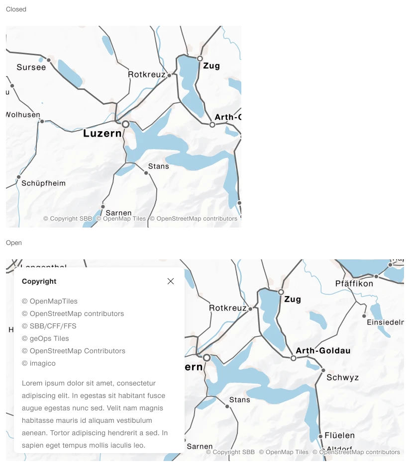
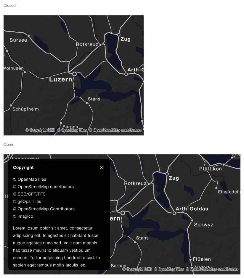
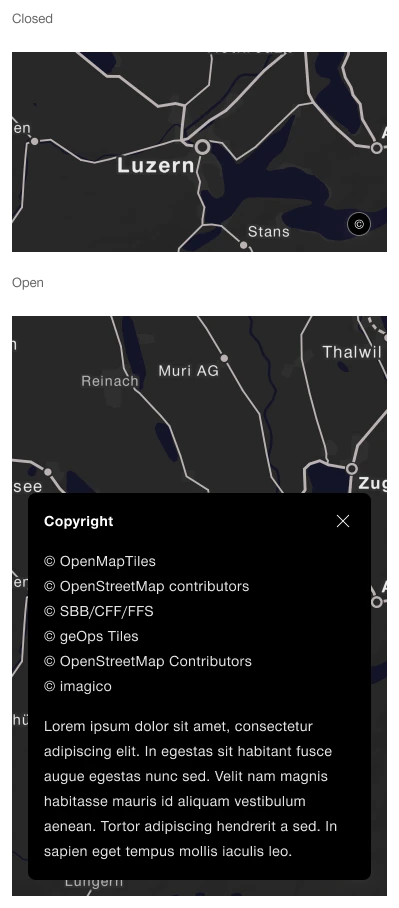
Shows copyright information for the map data in use.
Rules
- Place the links in the lower-right corner.
- Open a link in a separate browser tab when selected.
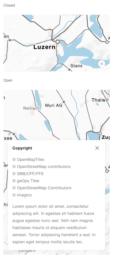
- If the screen is too small to display all links side by side, group them under a button in the lower-right corner. Selecting the button opens an overlay where users can choose a link.
States
The component has the following states:
- Default
- Hover
- Open (when there is not enough room for all links)
- Closed (when there is not enough room for all links)
Variants
The component has the following variants:
- Mode: light/dark
- Breakpoint: mobile/desktop
Mobile
Desktop