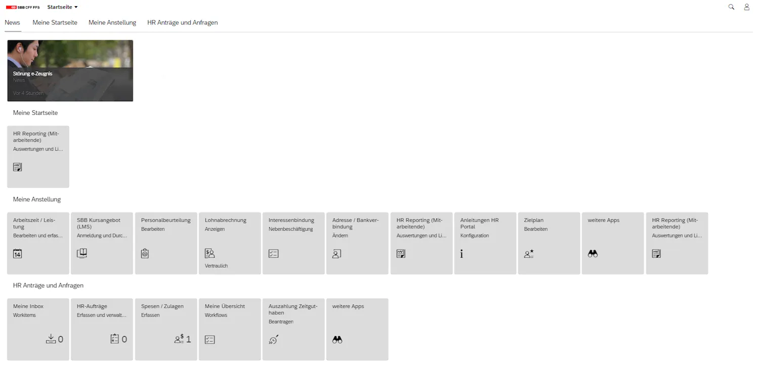
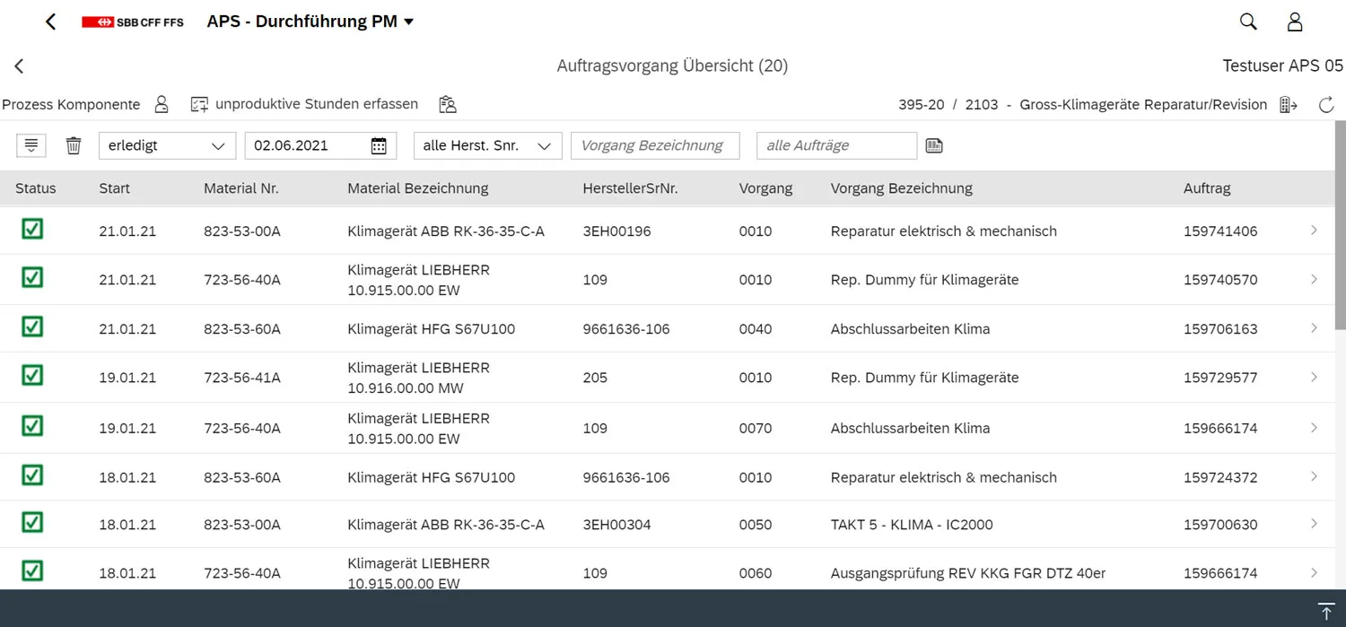
The SAP guidelines are a work in progress. At the moment it consists of first informations for consistent SBB SAP applications. The foundation for this is the
SBB Theme
Introduction
The basis to developing SBB SAP applications with consistent user experience forms the
The SBB Theme with integrated SBB logo and modified colour values is available for internal applications on the SAP Fiori Launchpad and SAP Business Technology Platform (BTP).
Contact:
To build visual extensions with HTML and CSS for modified user interfaces or themes for specific customer or ERP portals, like the "Immobilien Kunden Cockpit" please contact the
Examples


Logo
Usage
- The logo is used in all SBB SAP web applications and is embedded in the SBB Theme.
Rules
- The logo appears exactly once per page and is always in the header.
- The position is always top left.
- Modifications of the logo are not allowed.
- The logo is linked to the basic page of the SAP environment.
Icons
Usage
Icons serve as visual support for topics and actions for the users. To use them in SBB SAP applications the SAP icon font is to be utilised.
Should the existing SAP icon set not suffice, you can ask the UX experts of the Digital Solution or the
Independent creation of icons is allowed, but needs to be approved by the
Rules
- For the usage of SBB SAP applications the SAP icon font is generally to be used.
- The base vectors size for SAP icons is 16px for symbols that are used in the UI controls. Other listed sizes from 18px to 40px depend on individual requirements of the interface.
- One should abstain from using icons within a flowing text whenever possible.
- Icons without text need to be self-explanatory or easy to learn. The more icons are used in an application the harder it gets to correctly remember their meaning. The icons without text need to be supplemented with an alternative text, whereby not the icon itself but its action must be described (e.g. "Close Menu").
- Icons should always have the same meaning across applications and across Digital Solutions (consistency).
Links