-
Brand Brand Display
Figma
Code -
Image Image Display
Figma
Code -
Typography Typography Basics
Figma
Code -
Bottom-Sheet Bottom-Sheet Navigation Container
Figma
Code -
Button Button Action
Figma
Code -
Checkbox Checkbox Form
Figma
Code -
Chip Chip Form
Figma
Code -
Container Container Container
Figma
Code -
Context-Menu Context-Menu Navigation
Figma
Code -
Dropdown Dropdown Navigation Form
Figma
Code -
Header Header Navigation
Figma
Code -
Header-Box Header-Box Navigation
Figma
Code -
List-Item List-Item Action
Figma
Code -
List-View List-View Container
Figma
Code -
Loading-Indicator Loading-Indicator Indicator
Figma
Code -
Message Message Indicator
Figma
Code -
Notification-Box Notification-Box Indicator
Figma
Code -
Paginator Paginator Indicator
Figma
Code -
Picker Picker Form
Figma
Code -
Promotion-Box Promotion-Box Container
Figma
Code -
Radio-Button Radio-Button Form
Figma
Code -
Segmented-Button Segmented-Button Navigation
Figma
Code -
Slider Slider Form
Figma
Code -
Status Status Indicator
Figma
Code -
Stepper Stepper Navigation
Figma
Code -
Switch Switch Form
Figma
Code -
Tabbar Tabbar Navigation
Figma
Code -
Text-Input Text-Input Form
Figma
Code -
Textarea Textarea Form
Figma
Code -
Toast Toast Indicator
Figma
Code -
Up-Dn-Counter Up-Dn-Counter Form Indicator
Figma
Code

Try using different or fewer search terms.
What does the component do?
- It dims the current view and puts a modal dialogue over it.
When should the component be used?
- When the user’s attention is required.
- When information/input is required from the user.
- When related content is to be displayed.
- When additional content is to be displayed.
- The component is not suitable for error messages, warnings or similar notifications.
Rules
- The user must always have the option of closing the modal dialogue.
- Any modal dialogue consists of a header (close icon and title) and content.
- The content must contain at least an interaction element (e.g. ‘save’ or ‘OK’).
- The modal dialogue cannot be used for error messages.
- The width and height of the dialogue is determined by the size of the content.
- A minimum space from the screen edge must be kept.
- The modal dialogue is closed if the dimmed section is clicked on.
- If the content is too big, a full-screen modal dialogue can be selected: see page types.
Accessibility
- Content outside the open dialog should no longer be accessible via screen reader.
Variants
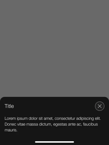
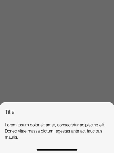
- With and without close button
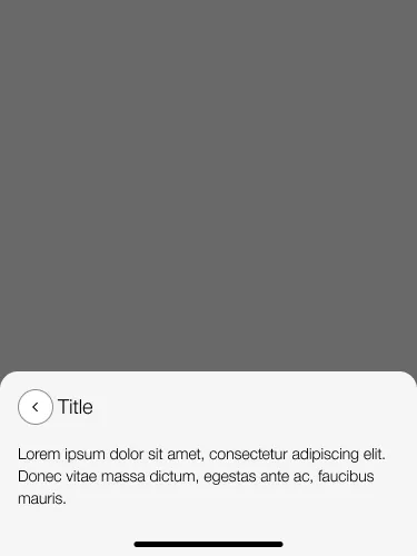
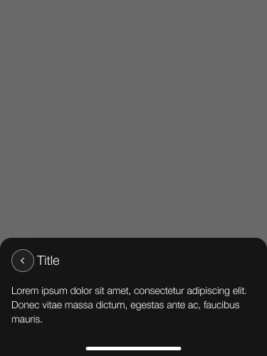
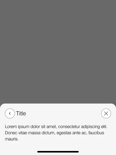
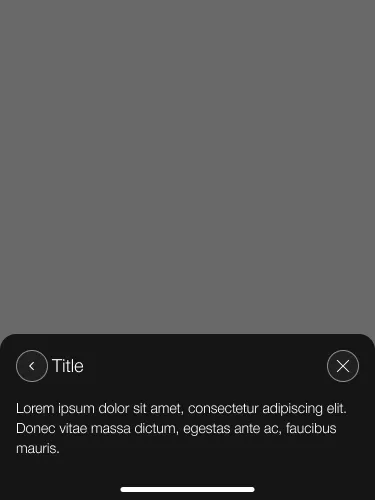
- With and without back button
With close button and without back button
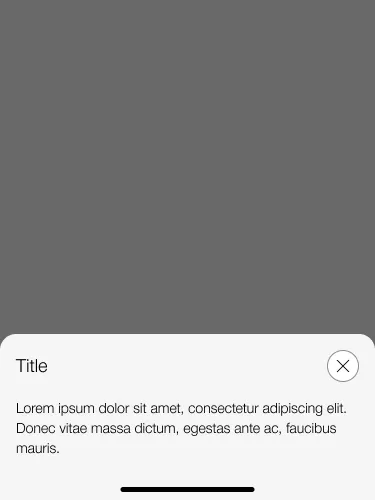
With close and back button
Without close and back button
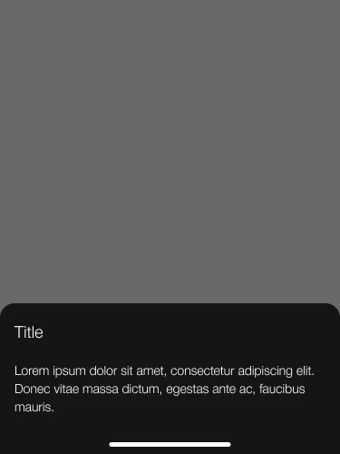
Without close button and wiht back button