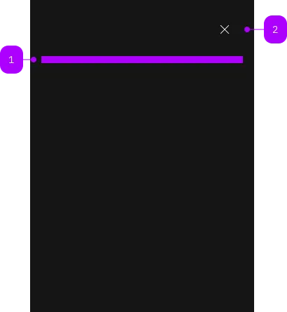
Was macht die Komponente?
Ein Overlay ist eine View, die den Hintergrund ausblendet oder abdunkelt, um den Fokus auf ein wichtiges Element wie ein Formular zu lenken.
Wann soll die Komponente eingesetzt werden?
- Um die Aufmerksamkeit der Nutzenden auf ein wichtiges Element zu lenken (z.B. Formular).
Regeln
- Der Hintergrund des Overlay kann halbtransparent oder deckend dargestellt werden. Die halbtransparente Variante eignet sich, wenn Hintergrundinformationen für die Nutzenden wichtig sind um beispielsweise die Orientierung zu gewährleisten.
- Stelle sicher, dass das Overlay keine wichtigen Hintergrundinformationen verdeckt, die für Nutzende notwendig sein könnten.

| Nummer | Typ | Beschreibung | Optional | Hinweis |
|---|---|---|---|---|
| 1 | Slot | Beliebiger Inhalt erlaubt | Nein | |
| 2 | Komponente | sbb-secondary-button | Nein |
Spielwiese
The <sbb-overlay> component provides a way to present content on top of the app's content,
and it's similar to the sbb-dialog.
It offers the following features:
- disables scrolling of the page content while open;
- manages focus properly by setting it on the first focusable element;
- has a close button, which is always visible;
- adds the appropriate ARIA roles automatically.
<sbb-overlay id="my-overlay">
  <p>Overlay content.</p>
</sbb-overlay>
Slots
There is only one unnamed slot to provide the overlay content.
Style
Setting the expanded property will cause the <sbb-overlay> component to take up the full width of the page.
It's possible to display the component in negative variant using the self-named property.
<sbb-overlay negative>
  <p>Overlay content.</p>
</sbb-overlay>
Interactions
In order to show the overlay, you need to provide a trigger or call the open() method on the <sbb-overlay> component.
<sbb-button id="overlay-trigger">Open overlay</sbb-button>

<sbb-overlay trigger="overlay-trigger">
  <p>Overlay content.</p>
</sbb-overlay>
Closing the overlay
The overlay can be closed in several ways:
-
Close button: The overlay has a built-in close button that is always visible.
-
sbb-overlay-close attribute: Add the
sbb-overlay-closeattribute to any element within the overlay
to close it when clicked. You can optionally provide a result value:<sbb-overlay> <p>Overlay content.</p> <sbb-button sbb-overlay-close="cancel">Cancel</sbb-button> <sbb-button sbb-overlay-close="confirm">Confirm</sbb-button> </sbb-overlay>Alternatively, you can use the
assignOverlayResult()helper to programmatically assign a complex result to an element:import { assignOverlayResult } from '@sbb-esta/lyne-elements/overlay.js'; const confirmButton = document.querySelector('sbb-button'); assignOverlayResult(confirmButton, { action: 'confirm', otherProp: 'any value' }); -
Escape key: Pressing the
Esckey will close the overlay. -
Programmatically: Call the
close(result?: any)method on the<sbb-overlay>element.
This method closes the overlay and emitsbeforecloseandcloseevents with the provided result as a payload.const overlay = document.querySelector('sbb-overlay'); overlay.close({ confirmed: true });
Handling close events
When the overlay closes, it emits two events:
beforeclose: Emitted before the closing transition begins. This event is cancelable by callingevent.preventDefault().close: Emitted after the overlay has fully closed.
Both events are of type SbbOverlayCloseEvent and provide access to:
result: The result value passed toclose(), assigned viaassignOverlayResult(), or the value of thesbb-overlay-closeattributecloseTarget: The element that triggered the close action (e.g., the clicked button), ornullif closed programmatically or via Escape key
overlay.addEventListener('close', (event) => {
  console.log('Result:', event.result);
  console.log('Close target:', event.closeTarget);
});
Accessibility
Controlling initial focus
The first element with the attribute sbb-focus-initial will receive focus on opening.
If the attribute is not used, the first focusable element receives focus.
Focus restoration
When closed, the overlay restores focus to the element that previously held focus when the
overlay opened by default. However, focus restoration can be disabled
by setting the skipFocusRestoration property to true.
As this is an accessibility feature, it is recommended to focus
an alternative element by listening to the didClose event.
API Documentation
class: SbbOverlayElement, sbb-overlay
Properties
| Name | Attribute | Privacy | Type | Default | Description |
|---|---|---|---|---|---|
accessibilityCloseLabel | accessibility-close-label | public | string | '' | This will be forwarded as aria-label to the close button element. |
accessibilityLabel | accessibility-label | public | string | '' | This will be forwarded as aria-label to the relevant nested element to describe the purpose of the overlay. |
expanded | expanded | public | boolean | false | Whether to allow the overlay content to stretch to full width. By default, the content has the appropriate page size. |
isOpen | - | public | boolean | Whether the element is open. | |
negative | negative | public | boolean | false | Negative coloring variant flag. |
skipFocusRestoration | skipFocusRestoration | public | boolean | false | Whether to skip restoring focus to the previously-focused element when the overlay is closed. Note that automatic focus restoration is an accessibility feature, and it is recommended that you provide your own equivalent, if you decide to turn it off. |
trigger | trigger | public | HTMLElement | null | null | The element that will trigger the menu overlay. For attribute usage, provide an id reference. |
Methods
| Name | Privacy | Description | Parameters | Return | Inherited From |
|---|---|---|---|---|---|
close | public | Closes the component. | result: any | void | SbbOpenCloseBaseElement |
escapeStrategy | public | The method which is called on escape key press. Defaults to calling close() | void | SbbOpenCloseBaseElement | |
open | public | Opens the component. | void | SbbOpenCloseBaseElement |
Events
| Name | Type | Description | Inherited From |
|---|---|---|---|
beforeclose | SbbOverlayCloseEvent | Emits whenever the component begins the closing transition. Can be canceled. | SbbOpenCloseBaseElement |
beforeopen | Event | Emits whenever the component starts the opening transition. Can be canceled. | SbbOpenCloseBaseElement |
close | SbbOverlayCloseEvent | Emits whenever the component is closed. | SbbOpenCloseBaseElement |
open | Event | Emits whenever the component is opened. | SbbOpenCloseBaseElement |
CSS Properties
| Name | Default | Description |
|---|---|---|
--sbb-overlay-z-index | var(--sbb-overlay-default-z-index) | To specify a custom stack order, the z-index can be overridden by defining this CSS variable. The default z-index of the component is set to var(--sbb-overlay-default-z-index) with a value of 1000. |
Slots
| Name | Description |
|---|---|
| Use the unnamed slot to provide a content for the overlay. |