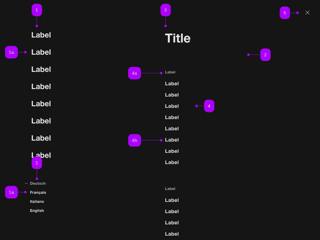
The sbb-navigation component provides a way to present a navigation menu.
Some of its features are:
- uses a native dialog element;
- creates a backdrop for disabling interaction below the navigation;
- disables scrolling of the page content while open;
- manages focus properly by setting it on the first focusable element or the first action with the
.sbb-active class; - can act as a host for components as sbb-navigation-list,
sbb-navigation-marker
and sbb-navigation-section;
Interactions
To display the sbb-navigation component you can either provide a trigger element using the trigger property,
or call the open() method on the sbb-navigation component.
<!-- Trigger element -->
<sbb-button id="nav-trigger">Navigation trigger</sbb-button>

<!-- Navigation component with navigation sections -->
<sbb-navigation trigger="nav-trigger">
  <sbb-navigation-marker>
    <sbb-navigation-button aria-current="page" id="nav-section-1">Label 1</sbb-navigation-button>
    <sbb-navigation-button id="nav-section-2">Label 2</sbb-navigation-button>
    <sbb-navigation-link href="https://www.sbb.ch/some/route">Label 3</sbb-navigation-link>
  <sbb-navigation-marker>

  <sbb-navigation-marker>
    <sbb-navigation-button aria-pressed="true">Language 1</sbb-navigation-button>
    <sbb-navigation-button aria-pressed="false">Language 2</sbb-navigation-button>
    <sbb-navigation-button aria-pressed="false">Language 3</sbb-navigation-button>
  <sbb-navigation-marker>

  <sbb-navigation-section trigger="nav-section-1">
    <span slot="label">Title 1</span>
    <sbb-navigation-list>
      <span slot="label">Label 1.1</span>
      <sbb-navigation-link href="...">Label 1.1.1</sbb-navigation-link>
      <sbb-navigation-link href="...">Label 1.1.2</sbb-navigation-link>
      <sbb-navigation-link href="...">Label 1.1.3</sbb-navigation-link>
    </sbb-navigation-list>
    ...
    <sbb-button>Something</sbb-button>
  </sbb-navigation-section>
  ...
</sbb-navigation>
Accessibility
On opening, the focus will be automatically set on the first focusable element or the first action with the .sbb-active class and, if the action with this class has a connected section, the section will be opened and the focus will be set on the first focusable element or the first action with the .sbb-active class in the section.
When a navigation action is marked to indicate the user is currently on that page, aria-current="page" should be set on that action.
Similarly, if a navigation action is marked to indicate a selected option (e.g., the selected language) aria-pressed should be set on that action.
Properties
| Name | Attribute | Privacy | Type | Default | Description |
accessibilityCloseLabel | accessibility-close-label | public | | string | undefined | | This will be forwarded as aria-label to the close button element. |
activeNavigationSection | - | public | HTMLElement | null | null | |
trigger | trigger | public | string | HTMLElement | null | null | The element that will trigger the navigation. Accepts both a string (id of an element) or an HTML element. |
Methods
| Name | Privacy | Description | Parameters | Return | Inherited From |
close | public | Closes the navigation. | | void | SbbOpenCloseBaseElement |
open | public | Opens the navigation. | | void | SbbOpenCloseBaseElement |
Events
| Name | Type | Description | Inherited From |
didClose | CustomEvent<void> | Emits whenever the sbb-navigation is closed. | SbbOpenCloseBaseElement |
didOpen | CustomEvent<void> | Emits whenever the sbb-navigation is opened. | SbbOpenCloseBaseElement |
willClose | CustomEvent<void> | Emits whenever the sbb-navigation begins the closing transition. Can be canceled. | SbbOpenCloseBaseElement |
willOpen | CustomEvent<void> | Emits whenever the sbb-navigation begins the opening transition. Can be canceled. | SbbOpenCloseBaseElement |
CSS Properties
| Name | Default | Description |
--sbb-navigation-z-index | var(--sbb-overlay-default-z-index) | To specify a custom stack order, the z-index can be overridden by defining this CSS variable. The default z-index of the component is set to var(--sbb-overlay-default-z-index) with a value of 1000. |
Slots
| Name | Description |
| Use the unnamed slot to add sbb-navigation-button/sbb-navigation-link elements into the sbb-navigation menu. |
