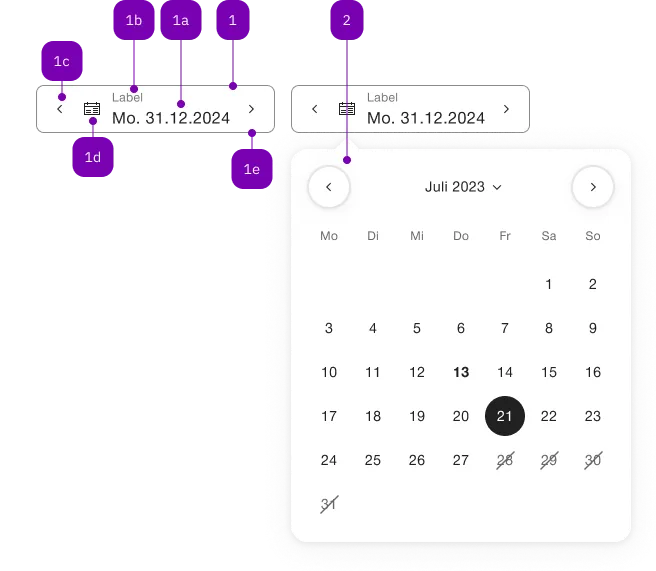
Was macht die Komponente?
Sie ist Teil der Date-Picker-Komponente.
Wann soll die Komponente eingesetzt werden?
- Nur innerhalb der Date-Picker-Komponente.
Übergeordnete Komponenten

| Nummer | Typ | Beschreibung | Optional | Hinweis |
|---|---|---|---|---|
| 1 | Komponente | sbb-form-field | Nein | |
| 1a | Standard-HTML | input | Nein | |
| 1b | Standard-HTML | label | Nein | |
| 1c | Komponente | sbb-datepicker-previous-day | Ja | |
| 1d | Komponente | sbb-datepicker-toggle | Ja | |
| 1e | Komponente | sbb-datepicker-next-day | Ja | |
| 2 | Komponente | sbb-datepicker | Nein |
Beispiele
The sbb-datepicker-next-day is a component closely connected to the sbb-datepicker;
when the two are used together, the sbb-datepicker-next-day can be used to choose
the date after the selected date, or tomorrow's date if the date-picker's input has no defined value.
The components can be connected using the datePicker property, which accepts the id of the sbb-datepicker,
or directly its reference.
<input id="datepicker-input" />
<sbb-datepicker input="datepicker-input" id="datepicker"></sbb-datepicker>
<sbb-datepicker-next-day date-picker="datepicker"></sbb-datepicker-next-day>
In sbb-form-field
If the two components are used within a sbb-form-field,
they are automatically linked and the sbb-datepicker-next-day will be projected in the suffix slot of the sbb-form-field;
otherwise, they can be connected using the datePicker property as described above.
The sbb-datepicker-next-day has an internal disabled state, which is set looking at the sbb-datepicker's input:
if it is disabled, or if the selected date is equal to the input's max attribute, the component is disabled.
<sbb-form-field>
  <input />
  <sbb-datepicker></sbb-datepicker>
  <sbb-datepicker-next-day></sbb-datepicker-next-day>
</sbb-form-field>
NOTE: Since the component needs the sbb-datepicker to work properly,
both standalone or within the sbb-form-field, they must have the same parent element to be correctly connected.
Properties
| Name | Attribute | Privacy | Type | Default | Description |
|---|---|---|---|---|---|
datePicker | date-picker | public | string | SbbDatepickerElement | undefined | Datepicker reference. | |
form | form | public | string | undefined | The | |
name | name | public | string | The name of the button element. | |
negative | negative | public | boolean | false | Negative coloring variant flag. |
type | type | public | SbbButtonType | 'button' | The type attribute to use for the button. |
value | value | public | string | The value of the button element. |