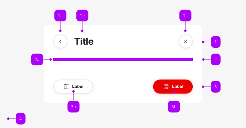
Was macht die Komponente?
Sie ist Teil der Dialog-Komponente.
Wann soll die Komponente eingesetzt werden?
- Nur innerhalb der Dialog-Komponente.

| Nummer | Typ | Beschreibung | Optional | Hinweis |
|---|---|---|---|---|
| 1 | Komponente | sbb-dialog-title | Nein | |
| 2 | Komponente | sbb-dialog-close-button | Ja | Close-Action |
| 2 | Slot | Beliebiger Inhalt erlaubt | Nein | |
| 4 | Komponente | sbb-dialog-actions | Ja | |
| 4a | Komponente | sbb-secondary-button | Ja | Auch Block-Links sind erlaubt |
| 4b | Komponente | sbb-button | Ja | Auch Block-Links sind erlaubt |
The sbb-dialog-close-button component extends the sbb-secondary-button component.
Use it in inside the sbb-dialog
to display a close button in the dialog.
The slot title-section is automatically assigned to be properly positioned on the sbb-dialog.
Clicking on the close button closes the corresponding dialog.
<sbb-dialog>
  <sbb-dialog-close-button></sbb-dialog-close-button>
  <sbb-dialog-content>Content</sbb-dialog-content>
</sbb-dialog>
Accessibility
An aria-label is automatically set. It's possible to override it.
Properties
| Name | Attribute | Privacy | Type | Default | Description |
|---|---|---|---|---|---|
disabled | disabled | public | boolean | false | Whether the component is disabled. |
disabledInteractive | disabled-interactive | public | boolean | false | Whether the button should be aria-disabled but stay interactive. |
form | form | public | HTMLFormElement | null | The <form> element to associate the button with. | |
iconName | icon-name | public | string | '' | The icon name we want to use, choose from the small icon variants from the ui-icons category from here https://icons.app.sbb.ch. |
loading | loading | public | boolean | false | Whether the button indicates a loading state. The animation kicks in after a delay of 300ms, configurable with --sbb-button-loading-delay CSS variable. |
name | name | public | string | Name of the form element. Will be read from name attribute. | |
negative | negative | public | boolean | false | Negative coloring variant flag. |
size | size | public | SbbButtonSize | 's' | Size variant, either l, m or s. |
type | type | public | SbbButtonType | 'button' | The type attribute to use for the button. |
validationMessage | - | public | string | Returns the current error message, if available, which corresponds to the current validation state. Please note that only one message is returned at a time (e.g. if multiple validity states are invalid, only the chronologically first one is returned until it is fixed, at which point the next message might be returned, if it is still applicable). Also, a custom validity message (see below) has precedence over native validation messages. | |
validity | - | public | ValidityState | Returns the ValidityState object for this element. | |
value | value | public | string | '' | Value of the form element. |
willValidate | - | public | boolean | Returns true if this element will be validated when the form is submitted; false otherwise. |
Methods
| Name | Privacy | Description | Parameters | Return | Inherited From |
|---|---|---|---|---|---|
checkValidity | public | Returns true if this element has no validity problems; false otherwise. Fires an invalid event at the element in the latter case. | boolean | SbbFormAssociatedMixin | |
reportValidity | public | Returns true if this element has no validity problems; otherwise, returns false, fires an invalid event at the element, and (if the event isn't canceled) reports the problem to the user. | boolean | SbbFormAssociatedMixin | |
setCustomValidity | public | Sets the custom validity message for this element. Use the empty string to indicate that the element does not have a custom validity error. | message: string | void | SbbFormAssociatedMixin |
CSS Properties
| Name | Default | Description |
|---|---|---|
--sbb-button-loading-delay | 300ms | The delay before the loading animation starts, when setting the button into loading state. |
Slots
| Name | Description |
|---|---|
| Use the unnamed slot to add content to the dialog-close-button. Not intended to be used in this context. | |
icon | Slot used to display the icon, if one is set. Not intended to be used in this context. |