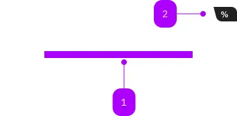
Was macht die Komponente?
Sie ist Teil der Card-Komponente.
Wann soll die Komponente eingesetzt werden?
- Nur innerhalb der Card-Komponente.

| Nummer | Typ | Beschreibung | Optional | Hinweis |
|---|---|---|---|---|
| 1 | Slot | Beliebiger Inhalt erlaubt | Nein | |
| 2 | Komponente | sbb-card-badge | Ja |
Spielwiese
The sbb-card-link is the component used to turn a sbb-card into a link.
<sbb-card-link href="https://www.sbb.ch">Check all the wonderful trips available.</sbb-card-link>
Link properties
The component is internally rendered as a link,
accepting its associated properties (href, target, rel and download).
Accessibility
It's important that a descriptive message is being slotted into the unnamed slot of sbb-card-link
as it is used for search engines and screen-reader users.
<sbb-card-link href="https://www.sbb.ch">Buy a half-fare ticket now</sbb-card-link>
Properties
| Name | Attribute | Privacy | Type | Default | Description |
|---|---|---|---|---|---|
accessibilityCurrent | accessibility-current | public | string | '' | This will be forwarded as aria-current to the inner anchor element. |
accessibilityLabel | accessibility-label | public | string | '' | This will be forwarded as aria-label to the inner anchor element. |
active | active | public | boolean | false | Whether the card is active. |
download | download | public | boolean | false | Whether the browser will show the download dialog on click. |
href | href | public | string | '' | The href value you want to link to. |
rel | rel | public | string | '' | The relationship of the linked URL as space-separated link types. |
target | target | public | LinkTargetType | string | '' | Where to display the linked URL. |
Slots
| Name | Description |
|---|---|
| Use the unnamed slot to add a descriptive label / title of the link (important!). This is relevant for SEO and screen readers. |