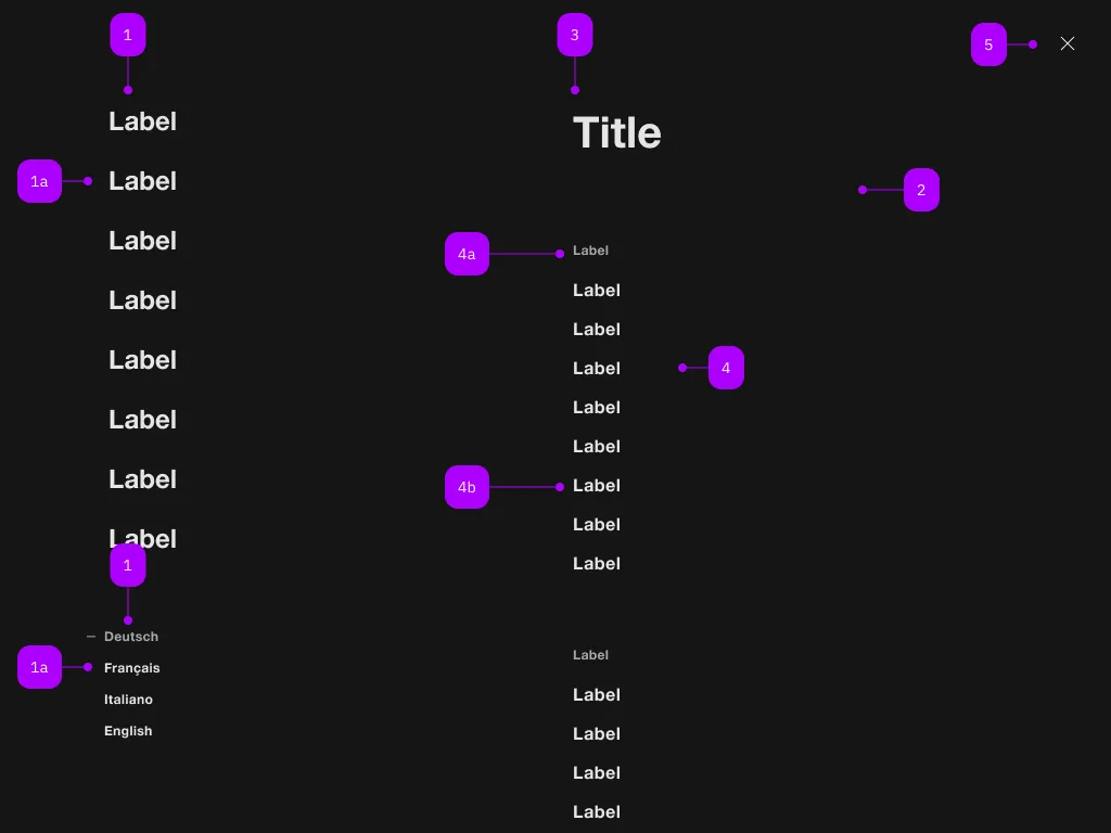
Was macht die Komponente?
Sie ist Teil der Navigation-Komponente.
Wann soll die Komponente eingesetzt werden?
- Nur innerhalb der Navigation-Komponente.

| Nummer | Typ | Beschreibung | Optional | Hinweis |
|---|---|---|---|---|
| 1 | Komponente | sbb-navigation-marker | Nein | |
| 1a | Komponente | sbb-navigation-link oder sbb-navigation-button | Nein | |
| 2 | Komponente | sbb-navigation-section | Nein | |
| 3 | Text | Label | Nein | |
| 4 | Komponente | sbb-navigation-list | Nein | |
| 4a | Text | Label | Nein | |
| 4b | Komponente | sbb-navigation-link oder sbb-navigation-button | Nein | |
| 5 | Komponente | sbb-transparent-button | Nein |
The sbb-navigation-section is a container for both sbb-navigation-list and sbb-button.
Its intended use is inside a sbb-navigation component, in which it can be seen as a 'second-level' panel.
Trigger
To display the sbb-navigation-section component you must provide a trigger element using the trigger property,
Optionally a label can be provided via slot or via the titleContent property.
<sbb-navigation-section trigger="nav1" titleContent="Title 1">
  <sbb-navigation-list label="Label 1.1">
    <sbb-navigation-link accessibility-current="page" href="...">Label 1.1.1</sbb-navigation-link>
    <sbb-navigation-link href="...">Label 1.1.2</sbb-navigation-link>
    ...
  </sbb-navigation-list>
  <sbb-button>Something</sbb-button>
</sbb-navigation-section>
Accessibility
When a navigation action is marked to indicate the user is currently on that page,
accessibility-current="page" (for sbb-navigation-links) or aria-current="page" (for sbb-navigation-buttons)
should be set on that action.
Similarly, if a navigation action is marked to indicate a selected option (e.g. the selected language),
aria-pressed should be set on that action.
Controlling initial focus
The first element with the attribute sbb-focus-initial will receive focus on opening.
If the attribute is not used, the first focusable element receives focus (recommended).
<sbb-navigation-section trigger="nav1">
  <sbb-navigation-list label="Label 1.1">
    <sbb-navigation-link href="...">Label 1.1.1</sbb-navigation-link>
    <sbb-navigation-link sbb-focus-initial href="...">Label 1.1.2</sbb-navigation-link>
    ...
  </sbb-navigation-list>
</sbb-navigation-section>
Properties
| Name | Attribute | Privacy | Type | Default | Description |
|---|---|---|---|---|---|
accessibilityBackLabel | accessibility-back-label | public | string | '' | This will be forwarded as aria-label to the back button element. |
accessibilityLabel | accessibility-label | public | string | '' | This will be forwarded as aria-label to the nav element and is read as a title of the navigation-section. |
isOpen | - | public | boolean | Whether the element is open. | |
titleContent | title-content | public | string | '' | The label to be shown before the action list. |
trigger | trigger | public | HTMLElement | null | null | The element that will trigger the navigation section. For attribute usage, provide an id reference. |
Methods
| Name | Privacy | Description | Parameters | Return | Inherited From |
|---|---|---|---|---|---|
close | public | Closes the navigation section. | void | SbbOpenCloseBaseElement | |
escapeStrategy | public | The method which is called on escape key press. Defaults to calling close() | void | SbbOpenCloseBaseElement | |
open | public | Opens the navigation section on trigger click. | void | SbbOpenCloseBaseElement |
Events
| Name | Type | Description | Inherited From |
|---|---|---|---|
beforeclose | Event | Emits whenever the component begins the closing transition. Can be canceled. | SbbOpenCloseBaseElement |
beforeopen | Event | Emits whenever the component starts the opening transition. Can be canceled. | SbbOpenCloseBaseElement |
close | Event | Emits whenever the component is closed. | SbbOpenCloseBaseElement |
open | Event | Emits whenever the component is opened. | SbbOpenCloseBaseElement |
Slots
| Name | Description |
|---|---|
Use the unnamed slot to add content into the sbb-navigation-section. |