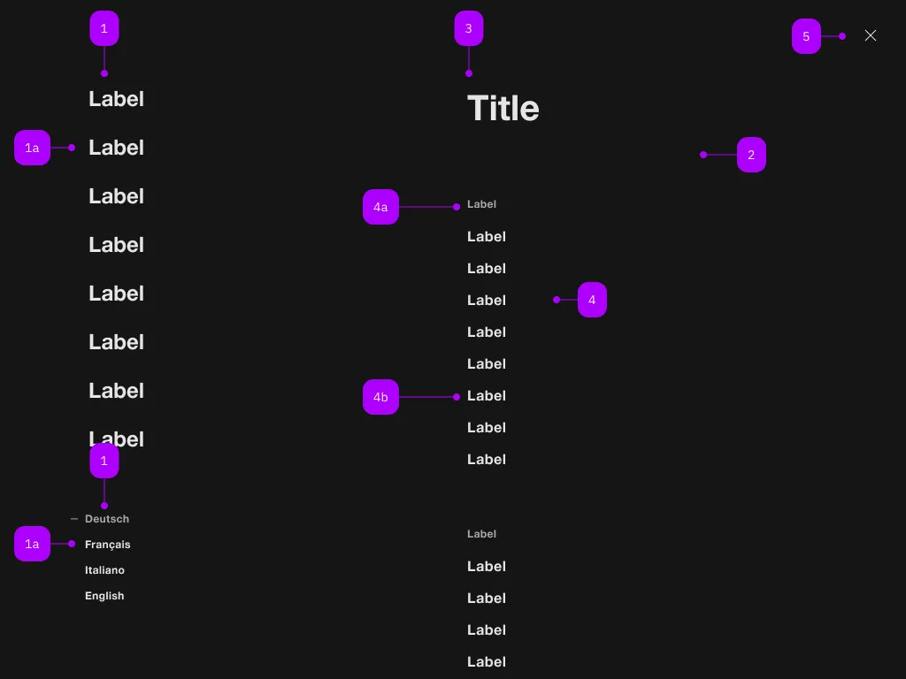
Was macht die Komponente?
Sie ist Teil der Navigation-Komponente.
Wann soll die Komponente eingesetzt werden?
- Nur innerhalb der Navigation-Komponente.

| Nummer | Typ | Beschreibung | Optional | Hinweis |
|---|---|---|---|---|
| 1 | Komponente | sbb-navigation-marker | Nein | |
| 1a | Komponente | sbb-navigation-link oder sbb-navigation-button | Nein | |
| 2 | Komponente | sbb-navigation-section | Nein | |
| 3 | Text | Label | Nein | |
| 4 | Komponente | sbb-navigation-list | Nein | |
| 4a | Text | Label | Nein | |
| 4b | Komponente | sbb-navigation-link oder sbb-navigation-button | Nein | |
| 5 | Komponente | sbb-transparent-button | Nein |
The sbb-navigation-button component is an action element contained by
a sbb-navigation-list component
or a sbb-navigation-marker component.
Button properties
The component is internally rendered as a button,
accepting its associated properties (type, name, value and form).
<sbb-navigation-button value="menu" name="menu">Button</sbb-navigation-button>
State
The navigation button can have an initial active state which can be set by using the class .sbb-active.
<sbb-navigation-button class="sbb-active" value="menu" name="menu">Button</sbb-navigation-button>
Style
The component has three different sizes, which can be changed using the size property (l, which is the default, m and s).
<sbb-navigation-button value="menu" name="menu" size="m">Button</sbb-navigation-button>
Properties
| Name | Attribute | Privacy | Type | Default | Description |
|---|---|---|---|---|---|
connectedSection | - | public | SbbNavigationSectionElement | undefined | The section that is being controlled by the action, if any. | |
form | form | public | HTMLFormElement | null | The <form> element to associate the button with. | |
marker | - | public | SbbNavigationMarkerElement | null | The navigation marker in which the action is nested. | |
name | name | public | string | Name of the form element. Will be read from name attribute. | |
section | - | public | SbbNavigationSectionElement | null | The section in which the action is nested. | |
size | size | public | SbbNavigationActionSize | 'l' / 's' (lean) | Action size variant, either s, m or l. |
type | type | public | SbbButtonType | 'button' | The type attribute to use for the button. |
validationMessage | - | public | string | Returns the current error message, if available, which corresponds to the current validation state. Please note that only one message is returned at a time (e.g. if multiple validity states are invalid, only the chronologically first one is returned until it is fixed, at which point the next message might be returned, if it is still applicable). Also, a custom validity message (see below) has precedence over native validation messages. | |
validity | - | public | ValidityState | Returns the ValidityState object for this element. | |
value | value | public | string | '' | Value of the form element. |
willValidate | - | public | boolean | Returns true if this element will be validated when the form is submitted; false otherwise. |
Methods
| Name | Privacy | Description | Parameters | Return | Inherited From |
|---|---|---|---|---|---|
checkValidity | public | Returns true if this element has no validity problems; false otherwise. Fires an invalid event at the element in the latter case. | boolean | SbbFormAssociatedMixin | |
reportValidity | public | Returns true if this element has no validity problems; otherwise, returns false, fires an invalid event at the element, and (if the event isn't canceled) reports the problem to the user. | boolean | SbbFormAssociatedMixin | |
setCustomValidity | public | Sets the custom validity message for this element. Use the empty string to indicate that the element does not have a custom validity error. | message: string | void | SbbFormAssociatedMixin |
Slots
| Name | Description |
|---|---|
Use the unnamed slot to add content to the sbb-navigation-button. |