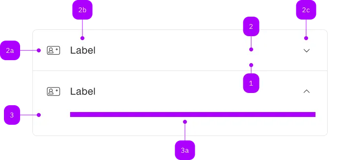
Was macht die Komponente?
Sie ist Teil der Accordion-Komponente.
Wann soll die Komponente eingesetzt werden?
- Nur innerhalb der Accordion-Komponente.

| Nummer | Typ | Beschreibung | Optional | Hinweis |
|---|---|---|---|---|
| 1 | Komponente | sbb-extension-panel | Nein | |
| 2 | Komponente | sbb-expansion-panel-header | Nein | |
| 2a | Komponente | sbb-icon | Ja | |
| 2b | Text | Label | Nein | |
| 2c | Komponente | sbb-icon | Nein | Zeigt den Zustand an |
| 3 | Komponente | sbb-expansion-panel-content | Nein | |
| 3a | Slot | Beliebiger Inhalt erlaubt | Nein |
The sbb-expansion-panel-header is a component which is meant to be used as a header
in the sbb-expansion-panel,
acting as a control for an expanding / collapsing content, like a native <summary> tag.
<sbb-expansion-panel-header>Header</sbb-expansion-panel-header>
Slots
The component is internally rendered as a button, and it is possible to provide text via an unnamed slot.
On the left side, a toggle icon is displayed; it flips based on the host's aria-expanded property.
The component can optionally display a sbb-icon at the component start using the iconName
property or via custom content using the icon slot.
If using the SBB icons, the icon should be a medium size icon.
<sbb-expansion-panel-header icon-name="swisspass-medium">Header</sbb-expansion-panel-header>
States
The component can be displayed in disabled state using the self-named property.
<sbb-expansion-panel-header disabled>Header</sbb-expansion-panel-header>
Events
When the element is clicked, the toggleexpanded event is emitted.
Properties
| Name | Attribute | Privacy | Type | Default | Description |
|---|---|---|---|---|---|
disabled | disabled | public | boolean | false | Whether the component is disabled. |
disabledInteractive | disabled-interactive | public | boolean | false | Whether the button should be aria-disabled but stay interactive. |
form | form | public | HTMLFormElement | null | The <form> element to associate the button with. | |
iconName | icon-name | public | string | '' | The icon name we want to use, choose from the small icon variants from the ui-icons category from here https://icons.app.sbb.ch. |
name | name | public | string | Name of the form element. Will be read from name attribute. | |
type | type | public | SbbButtonType | 'button' | The type attribute to use for the button. |
validationMessage | - | public | string | Returns the current error message, if available, which corresponds to the current validation state. Please note that only one message is returned at a time (e.g. if multiple validity states are invalid, only the chronologically first one is returned until it is fixed, at which point the next message might be returned, if it is still applicable). Also, a custom validity message (see below) has precedence over native validation messages. | |
validity | - | public | ValidityState | Returns the ValidityState object for this element. | |
value | value | public | string | '' | Value of the form element. |
willValidate | - | public | boolean | Returns true if this element will be validated when the form is submitted; false otherwise. |
Methods
| Name | Privacy | Description | Parameters | Return | Inherited From |
|---|---|---|---|---|---|
checkValidity | public | Returns true if this element has no validity problems; false otherwise. Fires an invalid event at the element in the latter case. | boolean | SbbFormAssociatedMixin | |
reportValidity | public | Returns true if this element has no validity problems; otherwise, returns false, fires an invalid event at the element, and (if the event isn't canceled) reports the problem to the user. | boolean | SbbFormAssociatedMixin | |
setCustomValidity | public | Sets the custom validity message for this element. Use the empty string to indicate that the element does not have a custom validity error. | message: string | void | SbbFormAssociatedMixin |
Events
| Name | Type | Description | Inherited From |
|---|---|---|---|
toggleexpanded | Event | Notifies that the sbb-expansion-panel is about to expand/shrink. |
Slots
| Name | Description |
|---|---|
Use the unnamed slot to add content to the sbb-expansion-panel-header. | |
icon | Slot used to render the sbb-expansion-panel-header icon. |