Zur Navigation Zum Inhalt Kontakt Menu Principles Foundation Accessibility Design System Guidelines Deutsch Français Italiano English Our design principles User-centred Recognisable Inclusive Reduced Holistic Self-explanatory Task-oriented Appropriate SBB Brand portal Logo Digital clock Rights of use Base colors Functional colors Off brand colors Icons Timetable icons Pictograms About accessibility Über diesen Guide Contact Further information Product Owner User Research Interaction Design Visual Design Development Content Design Testing What is a design system? Designing Coding FAQ Help Process Contribution Contact Overview Base Components Overview Releases Design Tokens Komponenten Overview Base Informationen Overview Base Components Sense & Purpose Community Assets Instructions Power-Apps Digital banner ads SAP Design Guidelines App Icons We show as little as possible and as much as necessary.
Reduziert

Our solutions support our users in carrying out a certain task – and in doing this as simply and effectively as possible. Only the information and functions necessary for the working step are suggested. This helps prevent cognitive overload.

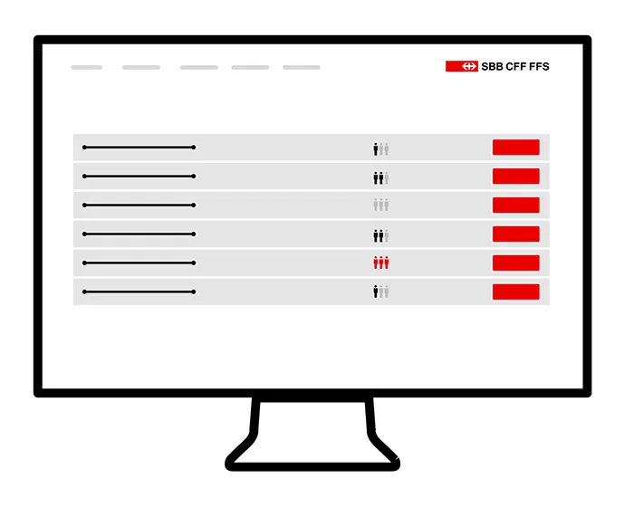
Example
Beispiel
We show the user only the necessary relevant information and avoid complex content. ​By consciously leaving out or hiding information at the first level, the operation/application is made simpler for users.​{.lead}

For example, on the timetable for the connection, only the start point, destination and number of stops are shown initially.

Imprint Contact Cookie settings