Zur Navigation Zum Inhalt Kontakt Menu Principles Foundation Accessibility Design System Guidelines Deutsch Français Italiano English Our design principles User-centred Recognisable Inclusive Reduced Holistic Self-explanatory Task-oriented Appropriate SBB Brand portal Logo Digital clock Rights of use Base colors Functional colors Off brand colors Icons Timetable icons Pictograms About accessibility Über diesen Guide Contact Further information Product Owner User Research Interaction Design Visual Design Development Content Design Testing What is a design system? Designing Coding FAQ Help Process Contribution Contact Overview Base Components Overview Releases Design Tokens Komponenten Overview Base Informationen Overview Base Components Sense & Purpose Community Assets Instructions Power-Apps Digital banner ads SAP Design Guidelines App Icons We offer a consistent experience within and between channels.
Wiedererkennbar

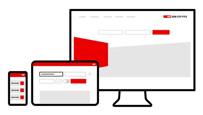
Our users should find their way easily around all SBB digital channels and access the information they require as quickly as possible. This means that consistent interaction patterns and design elements are used consistently across the different channels.

Example
Wiedererkennbar

Purchasing a ticket on the SBB website, SBB mobile app or from ticket machines is a clear and recognisable procedure for our customers. They know how it works with SBB. The same applies to internal business applications.​

Imprint Contact Cookie settings