Zur Navigation Zum Inhalt Kontakt Menu Find component Overview Mobile Principles Foundation Accessibility Design System Guidelines Deutsch Français Italiano English Our design principles User-centred Recognisable Inclusive Reduced Holistic Self-explanatory Task-oriented Appropriate SBB Brand portal Logo Digital clock Rights of use Base colors Functional colors Off brand colors Icons Timetable icons Pictograms About accessibility Über diesen Guide Contact Further information Product Owner User Research Interaction Design Visual Design Development Content Design Testing What is a design system? Designing Coding FAQ Help Process Contribution Contact Overview Base Components Overview Base Components Overview Base Components Overview Design Tokens Components Overview Base Informationen Sense & Purpose Community Assets Instructions Power-Apps Digital banner ads SAP Design Guidelines App Icons
Find component

Mobile

Basics Brand

Brand

Image

Image

Typography

Typography

Components Button

Button

Checkbox

Checkbox

Chip

Chip

Context menu

Context menu

Dropdown

Dropdown

Header

Header

List item

List item

List view

List view

Loading indicator

Loading indicator

Message

Message

Modal view

Modal view

Notifcation

Notifcation

Pagination

Pagination

Picker

Picker

Radiobutton

Radiobutton

Segmented button

Segmented button

Slider

Slider

Switch

Switch

Tabbar

Tabbar

Text input

Text input

Textarea

Textarea

Toast

Toast

Up dn counter

Up dn counter

Switch Overview

What does the component do?

  • It is used for activating or deactivating individual setting options.

When should the component be used?

  • When setting options have to be activated or deactivated.

Rules

  • It can only be used for activating or deactivating a function.
  • No ‘on’ and ‘off’ labels can be used.
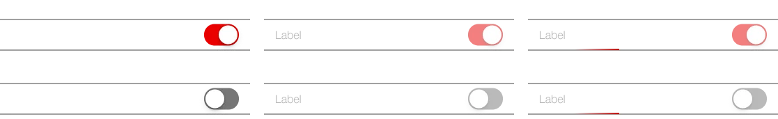
  • The setting option must be clearly named using a label on the left.
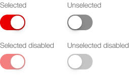
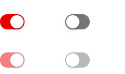
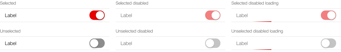
States and variants

States

The component has the following states:

  • Selected
  • Unselected
  • Disabled selected
  • Disabled unselected
  • Loading
  • Error (default / retry / reloading / button)

Variants

The component has the following variants:

  • Switch
    • Selected / unselected
  • Switch-Item
    • without icon / with icon
    • listed / boxed
    • without subtext / with subtext
    • without link / with link

Switch

Image of the switch, default

Switch-Item

Liste

Image of the switch-item in a list

Liste, mit Icon

Image of the switch-item in a list with icon

Liste, mit Subtext

Image of the switch-item in a list with subtext

Liste, mit Link

Image of the switch-item in a list with link

Boxed

Image of the switch-item in a box

Boxed, mit Icon

Image of the switch-item in a box with icon

Boxed, mit Subtext

Image of the switch-item in a box with subtext

Boxed, mit Link

Image of the switch-item in a box with link

Specification

Design

Imprint Contact Cookie settings