Zur Navigation
Zum Inhalt
Kontakt
Menu
Find component
Overview Mobile
Find component
Enter keyword
More Info
Brand
Display
Figma
Code
More Info
Image
Display
Figma
Code
More Info
Typography
Basics
Figma
Code
More Info
Bottom-Sheet
Navigation
Container
Figma
Code
More Info
Button
Action
Figma
Code
More Info
Checkbox
Form
Figma
Code
More Info
Chip
Form
Figma
Code
More Info
Container
Container
Figma
Code
More Info
Context-Menu
Navigation
Figma
Code
More Info
Dropdown
Navigation
Form
Figma
Code
More Info
Header
Navigation
Figma
Code
More Info
Header-Box
Navigation
Figma
Code
More Info
Stepper
Navigation
Figma
Code
More Info
List-Item
Action
Figma
Code
More Info
List-View
Container
Figma
Code
More Info
Loading-Indicator
Indicator
Figma
Code
More Info
Message
Indicator
Figma
Code
More Info
Notification-Box
Indicator
Figma
Code
More Info
Paginator
Indicator
Figma
Code
More Info
Picker
Form
Figma
Code
More Info
Promotion-Box
Container
Figma
Code
More Info
Radio-Button
Form
Figma
Code
More Info
Segmented-Button
Navigation
Figma
Code
More Info
Slider
Form
Figma
Code
More Info
Status
Indicator
Figma
Code
More Info
Switch
Form
Figma
Code
More Info
Tabbar
Navigation
Figma
Code
More Info
Text-Input
Form
Figma
Code
More Info
Textarea
Form
Figma
Code
More Info
Toast
Indicator
Figma
Code
More Info
Up-Dn-Counter
Form
Indicator
Figma
Code
No search results were found.
Try using different or fewer search terms.
Principles
Foundation
Accessibility
Design System
Guidelines
Deutsch
Français
Italiano
English
Our design principles
User-centred
Recognisable
Inclusive
Reduced
Holistic
Self-explanatory
Task-oriented
Appropriate
SBB Brand portal
Logo
Digital clock
Rights of use
Base colors
Additional colors
Off brand colors
Icons
Timetable icons
Pictograms
About accessibility
Über diesen Guide
Contact
Further information
Product Owner
User Research
Interaction Design
Visual Design
Development
Content Design
Testing
What is a design system?
Designing
Coding
FAQ
Help
Process
Contribution
Contact
Overview
Base
Components
Overview
Releases
Design Tokens
Components
Overview
Base
Informations
Overview
Base
Components
Overview
App Icons
Power-Apps
Digital banner ads
SAP Design Guidelines
AI Design: Basics
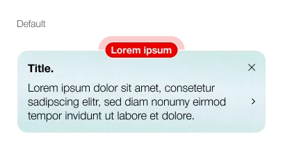
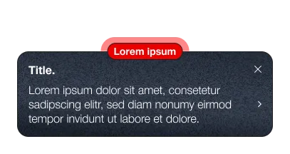
Promotion-Box
Overview
What does the component do?
Indicates a change within the app.
When should the component be used?
When introducing a new function.
In the event of a major change within the app.
Rules
The Promotion-Box can be closed once and no longer appears.
Description text has a maximum of 3 lines, additional information is displayed in a bottom sheet.
Variants
Variants
The component has the following variants:
Close-Button: Optional
Detail-Link: Optional
Promotion-Box
Spezifikationen
Design