-
Copyright Copyright Basics
Figma
Code -
Layer menu Layer menu Navigation
Figma
Code -
Floor selector Floor selector Navigation
Figma
Code -
My location My location Navigation
Figma
Code -
Zoom Zoom Navigation
Figma
Code -
Carousel Carousel Content
Figma
Code -
Map marker Map marker Content
Figma
Code -
Pop-up Pop-up Content
Figma
Code -
Routing Routing Navigation
Figma
Code -
Sidebar Sidebar Content
Figma
Code

Try using different or fewer search terms.
Usage
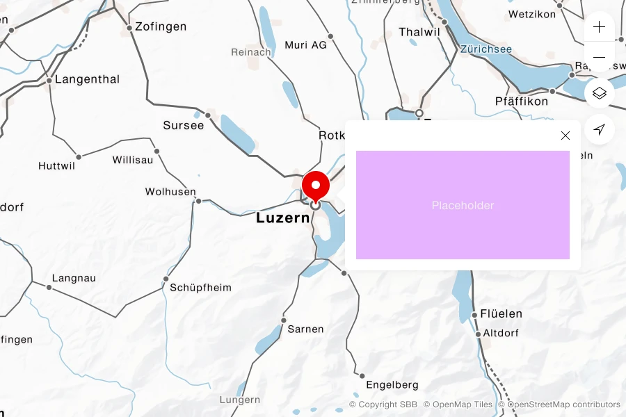
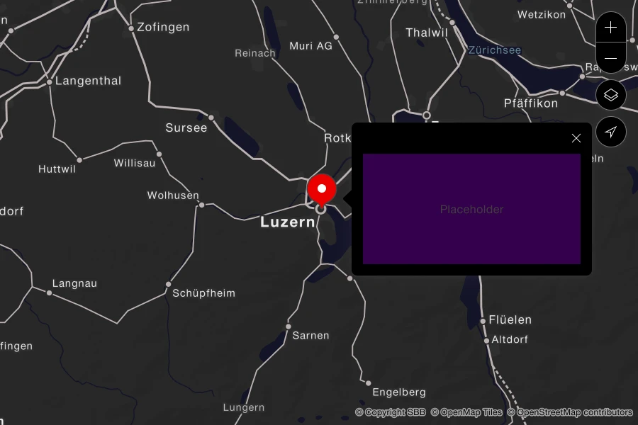
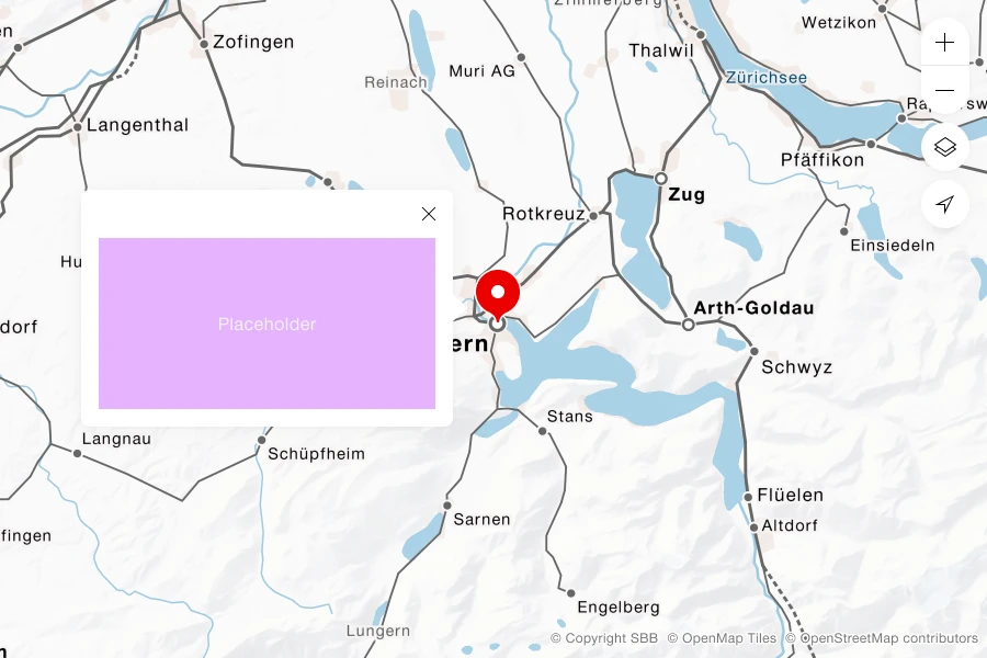
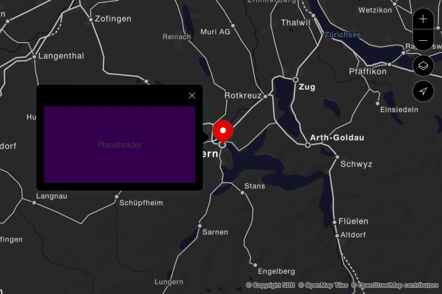
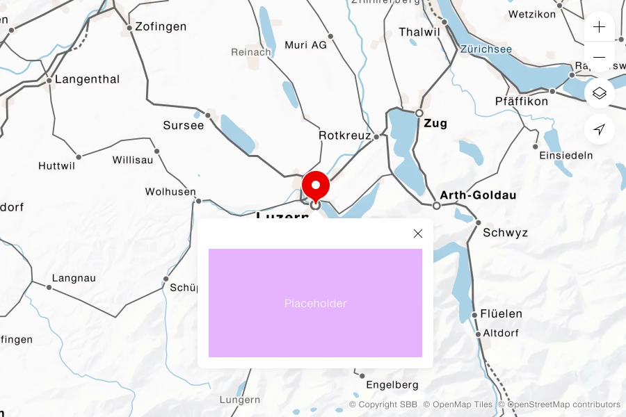
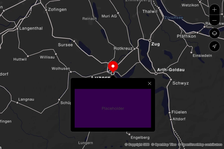
Shows additional information about a map marker in a pop-up.
Rules
- Keep the pop-up visible within the map viewport. Its position may change to the left, below or to the right when the map is moved.
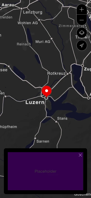
- On small screens, show the content in a box at the bottom of the screen, like a sidebar or card. The box has no fixed height.
- Provide a close button in the upper-right corner.
- If a marker has several pieces of information, show them vertically. Increase the pop-up height as needed or use pagination.
Variants
The component has the following variants:
- Mode: light/dark
- Breakpoint: desktop/mobile
- Position: left/bottom/right
Right
Left
Bottom
Mobile