What does the component do?
A toggle enables users to switch between two states, e.g. "Off" and "On".
When should the component be used?
- To provide a quick and easy way to activate or deactivate a function.
- When users need to change a setting that has an immediate effect.
- To present binary options clearly and intuitively.
Rules
- Avoid placing too many toggles on a page to ensure clarity and maintain usability.

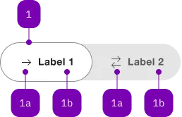
| Number | Type | Description | Optional | Info |
|---|---|---|---|---|
| 1 | Component | sbb-toggle-option | No | |
| 1a | Component | sbb-icon | Yes | |
| 1b | Text | Label | Yes |
Playground
The <sbb-toggle> component is a wrapper for <sbb-toggle-option> elements
that can be selected by the user; it is useful for switching between views within the content.
<sbb-toggle value="Value 1">
  <sbb-toggle-option value="Value 1" icon-name="arrow-right-small">Bern</sbb-toggle-option>
  <sbb-toggle-option value="Value 2" icon-name="arrows-right-left-small">Zürich</sbb-toggle-option>
</sbb-toggle>
Configuration
<sbb-toggle>
The even property can be used to let the component expand to the parent component or adapt to the label's width.
The component has two different sizes, s and m (default), which can be set using the size property.
<sbb-toggle size="s" even> ... </sbb-toggle>
<sbb-toggle-option>
It is possible to provide a label via an unnamed slot; the component can optionally display an <sbb-icon>
at the component start using the iconName property or via custom content using the icon slot.
Text and icon are not exclusive and can be used together.
<sbb-toggle-option value="Value" icon-name="app-icon-small"></sbb-toggle-option>

<sbb-toggle-option value="Value" icon-name="app-icon-small">Option</sbb-toggle-option>
Complex Values
This component supports any types of values, including complex objects.
The type can be specified using the generic type parameter T of SbbToggle<T>.
const values = [
  { value: 'value 1', name: 'Option 1' },
  { value: 'value 2', name: 'Option 2' },
];
<sbb-toggle .value="${values[0]}" name="name">
  <sbb-toggle-option .value="${values[0]}">Option 1</sbb-toggle-option>
  <sbb-toggle-option .value="${values[1]}">Option 2</sbb-toggle-option>
</sbb-toggle>
API Documentation
class: SbbToggleElement, sbb-toggle
Properties
| Name | Attribute | Privacy | Type | Default | Description |
|---|---|---|---|---|---|
disabled | disabled | public | boolean | false | Whether the component is disabled. |
even | even | public | boolean | false | If true, set the width of the component fixed; if false, the width is dynamic based on the label of the sbb-toggle-option. |
form | - | public | HTMLFormElement | null | Returns the form owner of this element. | |
name | name | public | string | Name of the form element. Will be read from name attribute. | |
options | - | public | SbbToggleOptionElement<T>[] | The child instances of sbb-toggle-option as an array. | |
size | size | public | 's' | 'm' | 'm' / 's' (lean) | Size variant, either m or s. |
validationMessage | - | public | string | Returns the current error message, if available, which corresponds to the current validation state. Please note that only one message is returned at a time (e.g. if multiple validity states are invalid, only the chronologically first one is returned until it is fixed, at which point the next message might be returned, if it is still applicable). Also, a custom validity message (see below) has precedence over native validation messages. | |
validity | - | public | ValidityState | Returns the ValidityState object for this element. | |
value | value | public | (T = string) | null | The value of the toggle. It needs to be mutable since it is updated whenever a new option is selected (see the onToggleOptionSelect() method). | |
willValidate | - | public | boolean | Returns true if this element will be validated when the form is submitted; false otherwise. |
Methods
| Name | Privacy | Description | Parameters | Return | Inherited From |
|---|---|---|---|---|---|
checkValidity | public | Returns true if this element has no validity problems; false otherwise. Fires an invalid event at the element in the latter case. | boolean | SbbFormAssociatedMixin | |
reportValidity | public | Returns true if this element has no validity problems; otherwise, returns false, fires an invalid event at the element, and (if the event isn't canceled) reports the problem to the user. | boolean | SbbFormAssociatedMixin | |
setCustomValidity | public | Sets the custom validity message for this element. Use the empty string to indicate that the element does not have a custom validity error. | message: string | void | SbbFormAssociatedMixin |
Events
| Name | Type | Description | Inherited From |
|---|---|---|---|
change | Event | The change event is fired when the user modifies the element's value. Unlike the input event, the change event is not necessarily fired for each alteration to an element's value. |
Slots
| Name | Description |
|---|---|
Use the unnamed slot to add <sbb-toggle-option> elements to the toggle. |
class: SbbToggleOptionElement, sbb-toggle-option
Properties
| Name | Attribute | Privacy | Type | Default | Description |
|---|---|---|---|---|---|
checked | checked | public | boolean | false | Whether the toggle-option is checked. |
disabled | disabled | public | boolean | false | Whether the component is disabled. |
iconName | icon-name | public | string | '' | The icon name we want to use, choose from the small icon variants from the ui-icons category from here https://icons.app.sbb.ch. |
value | value | public | (T = string) | null | null | Value of toggle-option. |
Slots
| Name | Description |
|---|---|
| Use the unnamed slot to add content to the label of the toggle option. | |
icon | Slot used to render the sbb-icon. |