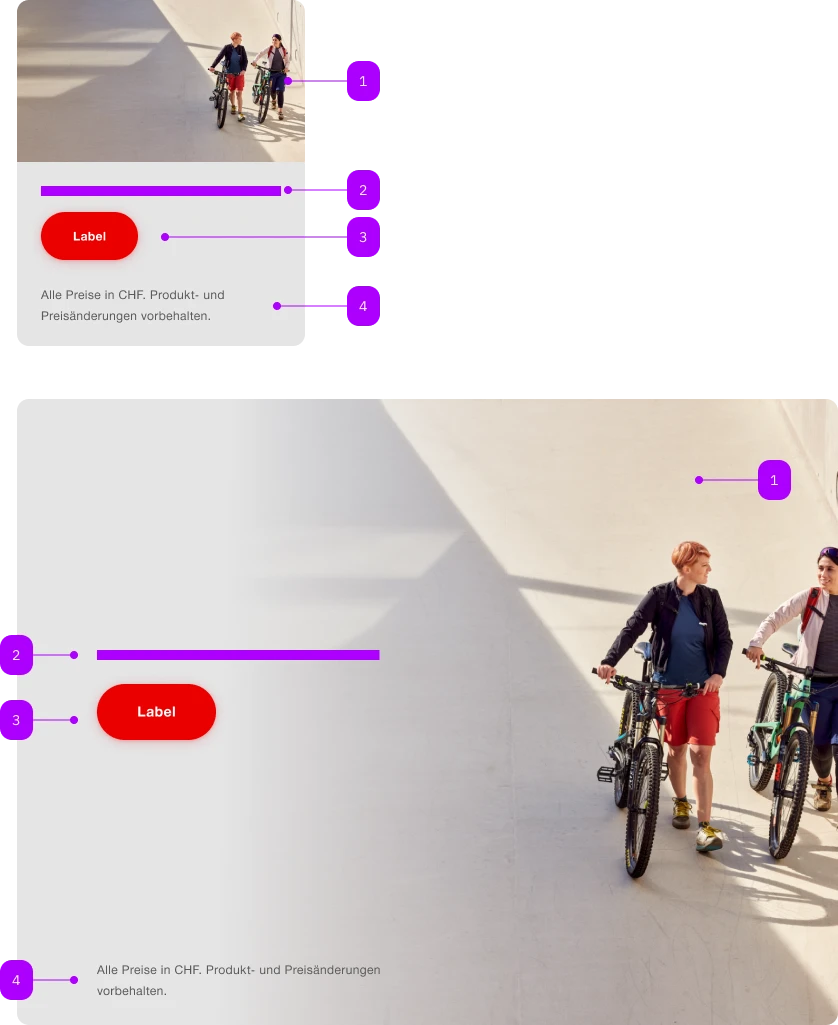
What does the component do?
A teaser is a preview that is intended to arouse users' curiosity and encourage them to click on further content or pages.
When should the component be used?
- To highlight and promote content, articles, products or services.
- To make users aware of further information or interesting content.
Rules
- Use a catchy and inviting headline and a short, interesting description.
- Do not use too many different teaser types and sizes on one page.
- Several teasers can be structured with one title.
- Only one CTA is permitted for the teaser-product. If several CTAs are required, the teaser-product-static can be used.

| Number | Type | Description | Optional | Info |
|---|---|---|---|---|
| 1 | Component | sbb-image | No | |
| 2 | Slot | Für textuellen Inhalt. | No | |
| 3 | Component | sbb-button | No | |
| 4 | Slot | Footnote | Yes |
Playground
Footnote Lorem ipsum dolor sit amet, consectetur adipiscing elit. Praesent pretium felis sitamet felis viverra lacinia. Donec et enim mi. Aliquam erat volutpat. Proin ut odio tellus. Donectempor mi vel dapibus lobortis.
The <sbb-teaser-product> is a component that can display a text and a footnote, combined with an image as background, to tease a product.
The whole component behaves like a link, and it is clickable; on small screens, the content follows the image.
The component can have at most a single interactive element in its static version (e.g. <sbb-button-static>).
If it has to include more than one interactive element, use the <sbb-teaser-product-static> element instead.
<sbb-teaser-product href="...">
  <sbb-image slot="image" image-src="..."></sbb-image>

  <p class="sbb-teaser-product--spacing">Content ...</p>

  <p slot="footnote" class="sbb-teaser-product--spacing">...</p>
</sbb-teaser-product>
Slots
Use the image slot to pass an <sbb-image> or an img that will be used as background.
Optionally, you can add an overlapping <sbb-chip-label> by wrapping the <sbb-image> in a figure tag (see sbb-image doc).
Use the optional footnote slot to add a text anchored to the bottom-end of the component.
The default slot is reserved for the main content: it could be a simple text or a text combined with more elements,
like the <sbb-title> or an interactive element, like a button or a link (needs to be in static variant!).
<sbb-teaser-product href="...">
  <figure slot="image" class="sbb-figure">
    <sbb-image image-src="..."></sbb-image>
    <sbb-chip-label class="sbb-figure-overlap-start-start">Chip label</sbb-chip-label>
  </figure>

  <p class="sbb-teaser-product--spacing">Content ...</p>
</sbb-teaser-product>
If paragraphs, title and/or button are used, consumers can apply the helper class sbb-teaser-product--spacing
to display the components with the correct spacings.
<sbb-teaser-product href="...">
  <sbb-image slot="image" image-src="..."></sbb-image>
  <sbb-title level="3" class="sbb-teaser-product--spacing">
    Benefit from up to 70% discount
  </sbb-title>
  <p class="sbb-teaser-product--spacing">
    Lorem ipsum dolor sit amet, consectetur adipiscing elit. Praesent pretium felis sit amet felis
    viverra lacinia. Donec et enim mi. Aliquam erat volutpat. Proin ut odio tellus.
  </p>
  <sbb-button-static class="sbb-teaser-product--spacing">Label</sbb-button-static>
</sbb-teaser-product>
Style
Use the image-alignment attribute to anchor the content after (on the left) or before (on the right).
<sbb-teaser-product image-alignment="before"> ... </sbb-teaser-product>
Add the negative attribute to enable the negative variant.
<sbb-teaser-product negative> ... </sbb-teaser-product>
Accessibility
It's important to set the accessibilityLabel on the <sbb-teaser-product>, which describes the link for screen-reader users.
Static variant
The <sbb-teaser-product-static> is a non-interactive version of the <sbb-teaser-product> component,
which can be used to tease a product without making the whole component interactive.
It should be used if there is more than one interactive action.
API Documentation
class: SbbTeaserProductElement, sbb-teaser-product
Properties
| Name | Attribute | Privacy | Type | Default | Description |
|---|---|---|---|---|---|
accessibilityCurrent | accessibility-current | public | string | '' | This will be forwarded as aria-current to the inner anchor element. |
accessibilityLabel | accessibility-label | public | string | '' | This will be forwarded as aria-label to the inner anchor element. |
download | download | public | boolean | false | Whether the browser will show the download dialog on click. |
href | href | public | string | '' | The href value you want to link to. |
imageAlignment | image-alignment | public | 'after' | 'before' | 'after' | Whether the fully visible part of the image is aligned 'before' or 'after' the content. Only relevant starting from large breakpoint. |
negative | negative | public | boolean | false | Negative coloring variant flag. |
rel | rel | public | string | '' | The relationship of the linked URL as space-separated link types. |
target | target | public | LinkTargetType | string | '' | Where to display the linked URL. |
CSS Properties
| Name | Default | Description |
|---|---|---|
--sbb-teaser-product-background-gradient-end | 75% | At which percentage the background should be fully transparent. |
--sbb-teaser-product-background-gradient-start | 25% | At which percentage the background should start getting transparent. |
Slots
| Name | Description |
|---|---|
| Use this slot to provide the main content. | |
footnote | Use this slot to provide a footnote. |
image | Use this slot to provide an image or a sbb-image as a background. |
class: SbbTeaserProductStaticElement, sbb-teaser-product-static
Properties
| Name | Attribute | Privacy | Type | Default | Description |
|---|---|---|---|---|---|
imageAlignment | image-alignment | public | 'after' | 'before' | 'after' | Whether the fully visible part of the image is aligned 'before' or 'after' the content. Only relevant starting from large breakpoint. |
negative | negative | public | boolean | false | Negative coloring variant flag. |
CSS Properties
| Name | Default | Description |
|---|---|---|
--sbb-teaser-product-background-gradient-end | 75% | At which percentage the background should be fully transparent. |
--sbb-teaser-product-background-gradient-start | 25% | At which percentage the background should start getting transparent. |
Slots
| Name | Description |
|---|---|
| Use this slot to provide the main content. | |
footnote | Use this slot to provide a footnote. |
image | Use this slot to provide an image or a sbb-image as a background. |