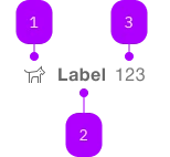
What does the component do?
It is part of the tab-group component.
When should the component be used?
- Only within the tab-group component.

| Number | Type | Description | Optional | Info |
|---|---|---|---|---|
| 1 | Component | sbb-icon | Yes | |
| 2 | Text | No | ||
| 3 | Text | Yes | Only numbers are allowed. |
Playground
The sbb-tab-label is a component which is meant to be used in combination with the
sbb-tab-group component
in order to display a tab label within the tab bar.
<sbb-tab-label>Tab Label</sbb-tab-label>
Slots
It is possible to provide a label via an unnamed slot; the component can optionally display a sbb-icon
at the component start using the iconName property or via custom content using the icon slot.
It's also possible to display a numeric amount at the component's end using the amount property or slot.
The label's heading tag can be changed using the level property.
<sbb-tab-label icon-name="app-icon-small" amount="123"> Tab Label </sbb-tab-label>

<sbb-tab-label>
  <sbb-icon slot="icon" name="circle-information-small"></sbb-icon>
  Tab Label
  <span slot="amount">123</span>
</sbb-tab-label>
States
It is possible to display the component in disabled state by using the self-named property.
<sbb-tab-label disabled> Tab Label </sbb-tab-label>
Properties
| Name | Attribute | Privacy | Type | Default | Description |
|---|---|---|---|---|---|
active | active | public | boolean | false | Active tab state. |
amount | amount | public | string | '' | Amount displayed inside the tab. |
disabled | disabled | public | boolean | false | Whether the component is disabled. |
group | - | public | SbbTabGroupElement | null | Get the parent sbb-tab-group. | |
iconName | icon-name | public | string | '' | The icon name we want to use, choose from the small icon variants from the ui-icons category from here https://icons.app.sbb.ch. |
level | level | public | SbbTitleLevel | '1' | The level will correspond to the heading tag generated in the title. Use this property to generate the appropriate header tag, taking SEO into consideration. |
tab | - | public | SbbTabElement | null | Get the sbb-tab related to the sbb-tab-label. |
Methods
| Name | Privacy | Description | Parameters | Return | Inherited From |
|---|---|---|---|---|---|
activate | public | Select the tab, deactivating the current selected one, and dispatch the tabchange event. | void | ||
deactivate | public | Deactivate the tab. | void |
Slots
| Name | Description |
|---|---|
| Use the unnamed slot to add content to the tab title. | |
amount | Provide a number to show an amount to the right of the title. |
icon | Use this slot to display an icon to the left of the title, by providing the sbb-icon component. |