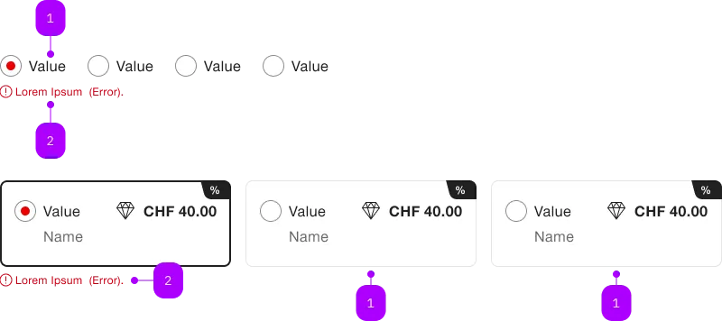
What does the component do?
It provides the layout for a group of radio buttons.
When should the component be used?
- Only in combination with the radio button component.

| Number | Type | Description | Optional | Info |
|---|---|---|---|---|
| 1a | Component | sbb-radiobutton | No | checked |
| 1b | Component | sbb-radiobutton | No | unchecked |
| 2 | Error | sbb-form-error | – |
Playground
The <sbb-radio-button> component provides the same functionality as a native <input type="radio"/> enhanced with the SBB Design.
Radio-buttons should typically be placed inside a sbb-radio-button-group component
in order to display a radio input within a group. Individual radio-buttons inside a radio-group will inherit the name of the group.
<sbb-radio-button-group name="radio-group" value="Value one" aria-label="Radio group label">
  <sbb-radio-button value="Value one">Option one</sbb-radio-button>
  <sbb-radio-button value="Value two">Option two</sbb-radio-button>
</sbb-radio-button-group>
In cases where that's not possible, you can define a group of radios using the same name property
<sbb-radio-button name="radio-group" value="Value one" checked>Option one</sbb-radio-button>
<sbb-radio-button name="radio-group" value="Value two">Option two</sbb-radio-button>
States
It is possible to display the component in disabled or checked state by using the self-named properties.
The component has a required property, which can be useful
for setting a custom sbb-error message
within a sbb-form-field.
The allowEmptySelection property allows user to deselect the component.
<sbb-radio-button value="One" checked>Option one</sbb-radio-button>

<sbb-radio-button value="Two" disabled>Option two</sbb-radio-button>

<sbb-radio-button value="Three" required>Option three</sbb-radio-button>

<sbb-radio-button value="Four" allowEmptySelection>Option four</sbb-radio-button>
Style
The component has three different sizes, which can be changed using the size property (m, which is the default, s and xs).
If used inside a <sbb-radio-button-group>, the size will be inherited from it.
<sbb-radio-button value="small" size="s">Size</sbb-radio-button>
The component's label can be displayed in bold using the sbb-text--bold class on a wrapper tag:
<sbb-radio-button value="bold">
  <span class="sbb-text--bold">Bold label</span>
</sbb-radio-button>
Complex Values
This component supports any types of values, including complex objects.
The type can be specified using the generic type parameter T of SbbRadioButton<T>.
<sbb-radio-button .value=${{value: 'value', name: 'name'}} name="name">Option</sbb-radio-button>
API Documentation
class: SbbRadioButtonElement, sbb-radio-button
Properties
| Name | Attribute | Privacy | Type | Default | Description |
|---|---|---|---|---|---|
allowEmptySelection | allow-empty-selection | public | boolean | false | Whether the radio can be deselected. |
checked | checked | public | boolean | false | Whether the radio button is checked. |
disabled | disabled | public | boolean | false | Whether the component is disabled. |
form | - | public | HTMLFormElement | null | Returns the form owner of this element. | |
group | - | public | SbbRadioButtonGroupElement | null | null | Reference to the connected radio button group. |
name | name | public | string | Name of the form element. Will be read from name attribute. | |
required | required | public | boolean | false | Whether the component is required. |
size | size | public | SbbRadioButtonSize | 'm' / 'xs' (lean) | Size variant, either xs, s or m. |
type | - | public | string | 'radio' | Form type of element. |
validationMessage | - | public | string | Returns the current error message, if available, which corresponds to the current validation state. Please note that only one message is returned at a time (e.g. if multiple validity states are invalid, only the chronologically first one is returned until it is fixed, at which point the next message might be returned, if it is still applicable). Also, a custom validity message (see below) has precedence over native validation messages. | |
validity | - | public | ValidityState | Returns the ValidityState object for this element. | |
value | value | public | (T = string) | null | null | The value of the form element |
willValidate | - | public | boolean | Returns true if this element will be validated when the form is submitted; false otherwise. |
Methods
| Name | Privacy | Description | Parameters | Return | Inherited From |
|---|---|---|---|---|---|
checkValidity | public | Returns true if this element has no validity problems; false otherwise. Fires an invalid event at the element in the latter case. | boolean | SbbFormAssociatedMixin | |
reportValidity | public | Returns true if this element has no validity problems; otherwise, returns false, fires an invalid event at the element, and (if the event isn't canceled) reports the problem to the user. | boolean | SbbFormAssociatedMixin | |
select | public | Set the radio-button as 'checked'; if 'allowEmptySelection', toggle the checked property. In both cases it emits the change events. | void | SbbRadioButtonCommonElementMixin | |
setCustomValidity | public | Sets the custom validity message for this element. Use the empty string to indicate that the element does not have a custom validity error. | message: string | void | SbbFormAssociatedMixin |
Events
| Name | Type | Description | Inherited From |
|---|---|---|---|
change | Event | The change event is fired when the user modifies the element's value. Unlike the input event, the change event is not necessarily fired for each alteration to an element's value. | SbbFormAssociatedRadioButtonMixin |
input | InputEvent | The input event fires when the value has been changed as a direct result of a user action. | SbbFormAssociatedRadioButtonMixin |
Slots
| Name | Description |
|---|---|
| Use the unnamed slot to add content to the radio label. |