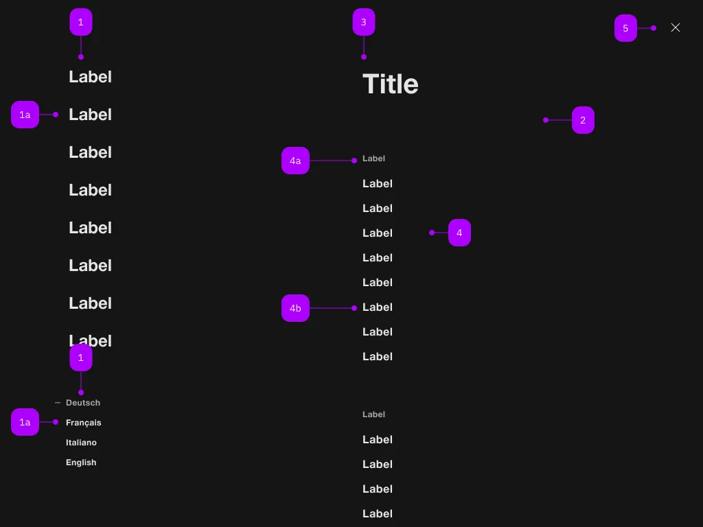
What does the component do?
It is part of the navigation component.
When should the component be used?
- Only within the navigation component.

| Number | Type | Description | Optional | Info |
|---|---|---|---|---|
| 1 | Component | sbb-navigation-marker | No | |
| 1a | Component | sbb-navigation-link oder sbb-navigation-button | No | |
| 2 | Component | sbb-navigation-section | No | |
| 3 | Text | Label | No | |
| 4 | Component | sbb-navigation-list | No | |
| 4a | Text | Label | No | |
| 4b | Component | sbb-navigation-link oder sbb-navigation-button | No | |
| 5 | Component | sbb-transparent-button | No |
The sbb-navigation-marker component is a collection of sbb-navigation-button
and sbb-navigation-link.
Its intended use is inside a sbb-navigation component.
<sbb-navigation-marker>
  <sbb-navigation-button id="nav1">Label 1</sbb-navigation-button>
  <sbb-navigation-button id="nav2">Label 2</sbb-navigation-button>
  <sbb-navigation-link href="https://www.sbb.ch/some/route">Label 3</sbb-navigation-link>
  <sbb-navigation-marker></sbb-navigation-marker
></sbb-navigation-marker>
Style
The component has a property named size which is proxied to all the sbb-navigation-button/sbb-navigation-link within it.
Possible values are l (default) and s.
<sbb-navigation-marker size="s">
  ...
  <sbb-navigation-marker></sbb-navigation-marker
></sbb-navigation-marker>
Properties
| Name | Attribute | Privacy | Type | Default | Description |
|---|---|---|---|---|---|
size | size | public | 'l' | 's' | 'l' / 's' (lean) | Marker size variant, either s or l. |
Methods
| Name | Privacy | Description | Parameters | Return | Inherited From |
|---|---|---|---|---|---|
reset | public | void | |||
select | public | action: SbbNavigationButtonElement | SbbNavigationLinkElement | void |
Slots
| Name | Description |
|---|---|
Use the unnamed slot to add sbb-navigation-button/sbb-navigation-link elements into the sbb-navigation-marker. |