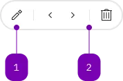
What does the component do?
A mini button group is a horizontal arrangement of mini buttons.
When should the component be used?
- To display a list of several mini buttons in a space-saving and clear manner.
Rules
- Mini buttons can be grouped thematically with the divider component.
- The available sizes (S, M, L, XL) are based on the available form elements and should be used consistently.

| Number | Type | Description | Optional | Info |
|---|---|---|---|---|
| 1 | Component | sbb-mini-button | No | |
| 2 | Component | sbb-divider | Yes |
Playground
The sbb-mini-button-group component displays a set of sbb-mini-button
optionally separated by a sbb-divider.
<sbb-mini-button-group accessibility-label="...">
  <sbb-mini-button icon-name="..." aria-label="..."></sbb-mini-button>
  <sbb-mini-button icon-name="..." aria-label="..."></sbb-mini-button>
  <sbb-divider orientation="vertical"></sbb-divider>
  <sbb-mini-button icon-name="..." aria-label="..."></sbb-mini-button>
</sbb-mini-button-group>
Style
The component has a negative variant which can be set using the negative property.
There are four available sizes: s, m (default), l and xl.
<sbb-mini-button-group negative size="l"> ... </sbb-mini-button-group>
Accessibility
Use the accessibility-label property to describe the purpose of the sbb-mini-button-group for screen-reader users.
If sbb-divider components are used as separators, their aria-hidden property is automatically set to true
to ensure that the button list is read by screen readers with the correct size.
Properties
| Name | Attribute | Privacy | Type | Default | Description |
|---|---|---|---|---|---|
accessibilityLabel | accessibility-label | public | string | '' | This will be forwarded as aria-label to the list that contains the buttons. |
negative | negative | public | boolean | false | Negative coloring variant flag. |
size | size | public | SbbMiniButtonGroupSize | 'm' / 's' (lean) | Size variant, either s, m, l or xl. |
Slots
| Name | Description |
|---|---|
Use the unnamed slot to add sbb-mini-button and sbb-divider elements. |