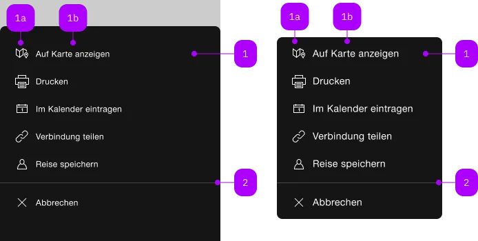
What does the component do?
It is part of the menu component.
When should the component be used?
- Only within the menu component.

| Number | Type | Description | Optional | Info |
|---|---|---|---|---|
| 1 | Component | sbb-menu-button oder sbb-menu-link | No | |
| 1a | Component | sbb-icon | No | |
| 1b | Text | Label | Yes | |
| 2 | Component | sbb-divider | Yes |
Playground
The component represents a button element contained by the sbb-menu component.
Slots
It is possible to provide a label via an unnamed slot; the component can optionally display a sbb-icon
at the component start using the iconName property or via custom content using the icon slot.
<sbb-menu-button>Text</sbb-menu-button>

<sbb-menu-button icon-name="pie-small">Another text</sbb-menu-button>
Badge
A badge can be rendered on the icon as white text in a red circle via the sbb-badge attribute.
It's recommended to hide the badge when the menu button is disabled.
It's mandatory to provide the badge information for screen readers either with an aria-label
or a hidden text (<sbb-screen-reader-only> for example).
<sbb-menu-button
  sbb-badge="2"
  aria-label="Show messages, 2 new messages available"
  icon-name="pie-small"
>
  Messages
</sbb-menu-button>
Button properties
The component is internally rendered as a button,
accepting its associated properties (type, name, value and form).
<sbb-menu-button value="menu" name="menu">Button</sbb-menu-button>
Accessibility
Interactive disabled buttons
Native disabled elements cannot receive focus and do not dispatch any events. This can
be problematic in some cases because it can prevent the app from telling the user why the button is
disabled. Consumers can use the disabledInteractive property to style the button as disabled but allow for
it to receive focus and dispatch events. The button will have aria-disabled="true" for assistive
technology. It is the consumers responsibility to provide a reason for the element being disabled.
This can be achieved by adding an aria-label, aria-labelledby or aria-describedby attribute.
Note: Using the disabledInteractive property can result in buttons that previously prevented
actions to no longer do so, for example a submit button in a form. When using this input, you should
guard against such cases in your component.
Properties
| Name | Attribute | Privacy | Type | Default | Description |
|---|---|---|---|---|---|
disabled | disabled | public | boolean | false | Whether the component is disabled. |
disabledInteractive | disabled-interactive | public | boolean | false | Whether the button should be aria-disabled but stay interactive. |
form | form | public | HTMLFormElement | null | The <form> element to associate the button with. | |
iconName | icon-name | public | string | '' | The icon name we want to use, choose from the small icon variants from the ui-icons category from here https://icons.app.sbb.ch. |
name | name | public | string | Name of the form element. Will be read from name attribute. | |
type | type | public | SbbButtonType | 'button' | The type attribute to use for the button. |
validationMessage | - | public | string | Returns the current error message, if available, which corresponds to the current validation state. Please note that only one message is returned at a time (e.g. if multiple validity states are invalid, only the chronologically first one is returned until it is fixed, at which point the next message might be returned, if it is still applicable). Also, a custom validity message (see below) has precedence over native validation messages. | |
validity | - | public | ValidityState | Returns the ValidityState object for this element. | |
value | value | public | string | '' | Value of the form element. |
willValidate | - | public | boolean | Returns true if this element will be validated when the form is submitted; false otherwise. |
Methods
| Name | Privacy | Description | Parameters | Return | Inherited From |
|---|---|---|---|---|---|
checkValidity | public | Returns true if this element has no validity problems; false otherwise. Fires an invalid event at the element in the latter case. | boolean | SbbFormAssociatedMixin | |
reportValidity | public | Returns true if this element has no validity problems; otherwise, returns false, fires an invalid event at the element, and (if the event isn't canceled) reports the problem to the user. | boolean | SbbFormAssociatedMixin | |
setCustomValidity | public | Sets the custom validity message for this element. Use the empty string to indicate that the element does not have a custom validity error. | message: string | void | SbbFormAssociatedMixin |
CSS Properties
| Name | Default | Description |
|---|---|---|
--sbb-menu-action-outer-horizontal-padding | var(--sbb-spacing-fixed-3x) | Can be used to modify horizontal padding. |
Slots
| Name | Description |
|---|---|
Use the unnamed slot to add content to the sbb-menu-button. | |
icon | Use this slot to provide an icon. If icon-name is set, a sbb-icon will be used. |